
Kanban Zone | UX Page Redesign FULL CASE STUDY
MY ROLE: Product Designer
TOOLS: Figma, ChatGPT
DURATION: 60+ hours
major redesign driven by UX iterations with new content
This is the industry client project I completed for my Springboard UX Bootcamp and is a real client project with Kanban Zone.
Problem
The pricing page of Kanban Zone, a tool for workplace management, features an outdated design and has low conversion rates. The client asked our team to improve conversion rates for product signup.
The Kanban method, which aims to manage tasks and achieve specific objectives, originated in Japan.
Solution
My team of three UX designers and I collaborated with CEO Dimitri Ponomareff to revamp Kanban Zone’s pricing page. We modernized the page by updating the design and incorporating user feedback from usability testing. One major improvement was enhancing the mobile responsiveness of the page to match those of their competitors.
Click to enlarge images.I am presenting simplified images for faster user scrolling.
All information in this case study is my own and does not reflect the views of the client. For privacy, I have modified the information to be non-confidential.
Product Demo
Existing Site
Redesigned Site
Role
As a lead product designer, I managed client requirements and lead design work weekly sprints. I led a team of three other designers and was responsible for creating project documentation, creating client product requirements(PRD), setting up weekly scrums, providing guidance, and handling all client communications.
What Others Do Well
Our team did product research on direct and tangential competitors and what they did well. We analyzed their strengths and weaknesses to determine what we could incorporate into our redesign.
Mine included Asana, Monday, and ClickUp of their pricing pages.
 We used ChatGPT to analyze market product needs met from competitors.
Asana
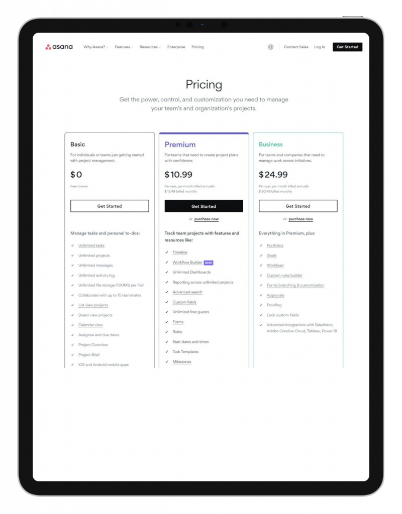
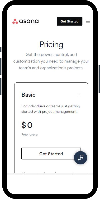
- Clean typography
- Selective user of color
- Mobile view accordion vertical UI
- Hover modals to indicate plan features on click (without leaving page)
Monday
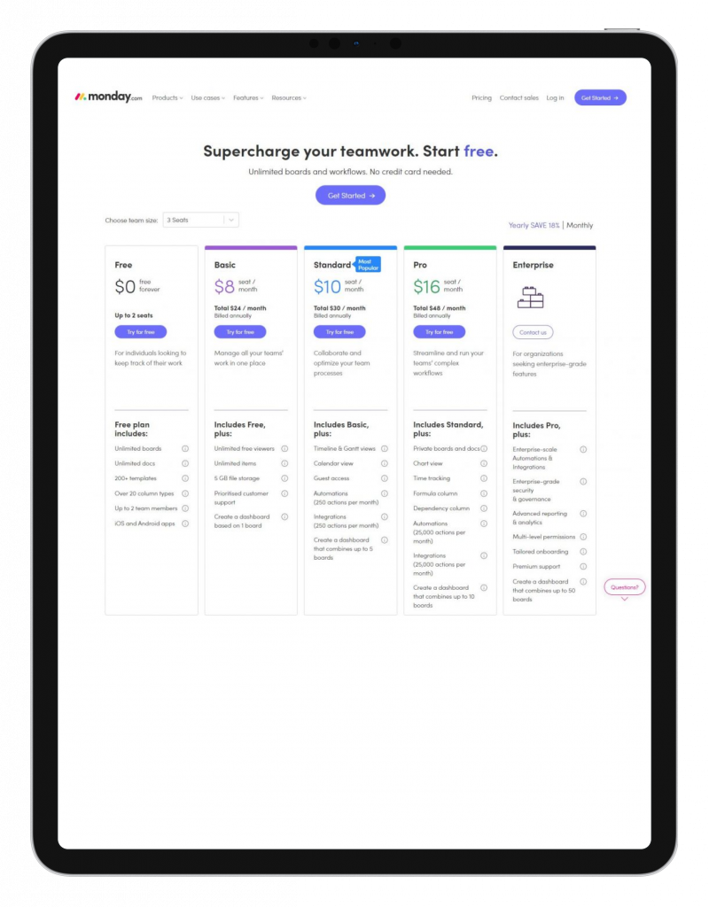
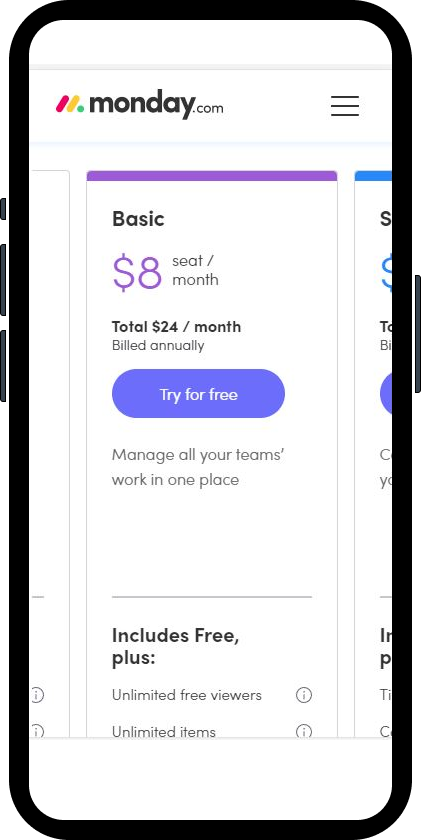
- Intuitive mobile horizontal scrolling
- Consistent visual language with minimal indicators
- Strong CTA callout before details
ClickUp
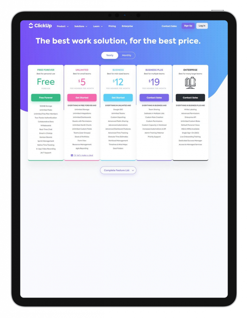
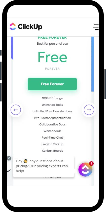
- Intuitive mobile horizontal scrolling
- Clear visual language to indicate tiers
- Short text descriptions to highlight key features of each plan
Apple (Honorary Mention)
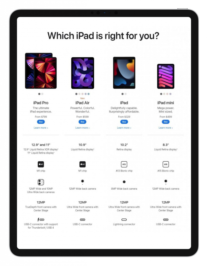
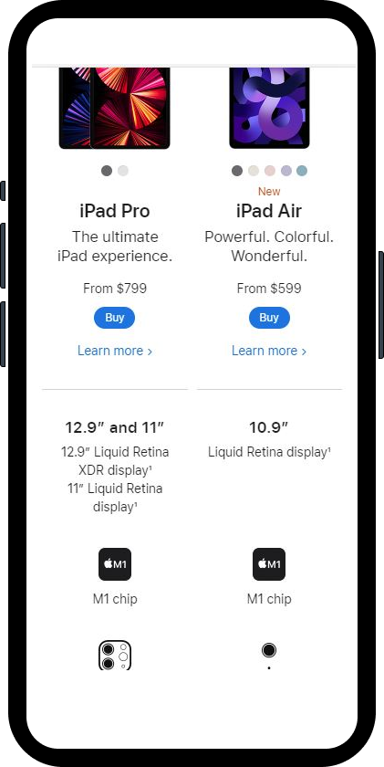
- Use of iconography to indicate features
- Short explanation to expand on icon if needed via UX accordion
- No tables or boxes to give user “breathing room”
Site UX Recommendations
Based on our research of competitors, we recommended to the client the global UX improvements we found in their competitors.
 use UX to highlight key information first and use modals for detailed information
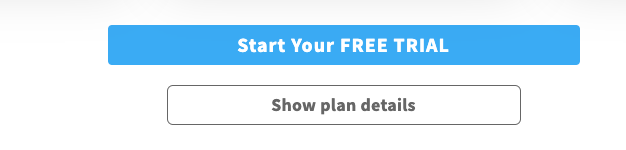
- the purchase plan CTA is within the first page of the user screen
- Highlight the desired featured plan with color and iconography for purchase
- Use modal to show specific detail information
- Use horizontal navigation for a user friendly mobile experience for category sub-elements
Client Feedback
The client approved our UX recommendations for improving the scan-ability of the page. While suggesting that we retain some of the existing UI patterns and color schemes to maintain familiarity for returning users, the client was supportive of our UI ideas and encouraged us to explore further.
The Ideal User
 As a user, I want to find a work management Kanban-based plan for my org.
Oscar is a small business owner looking for a great Kanban-based plan without paying for the cost of a expensive plan like Asana.
How It Works
After receiving the specs and ‘Oscar’ persona from the client, I conducted a variety sketch exercise to create designs for desktop and tablet. I incorporated common UI and UX patterns that I identified during my research. My main objective was to draw attention to the featured plan and ensure that plan details were easily scannable.
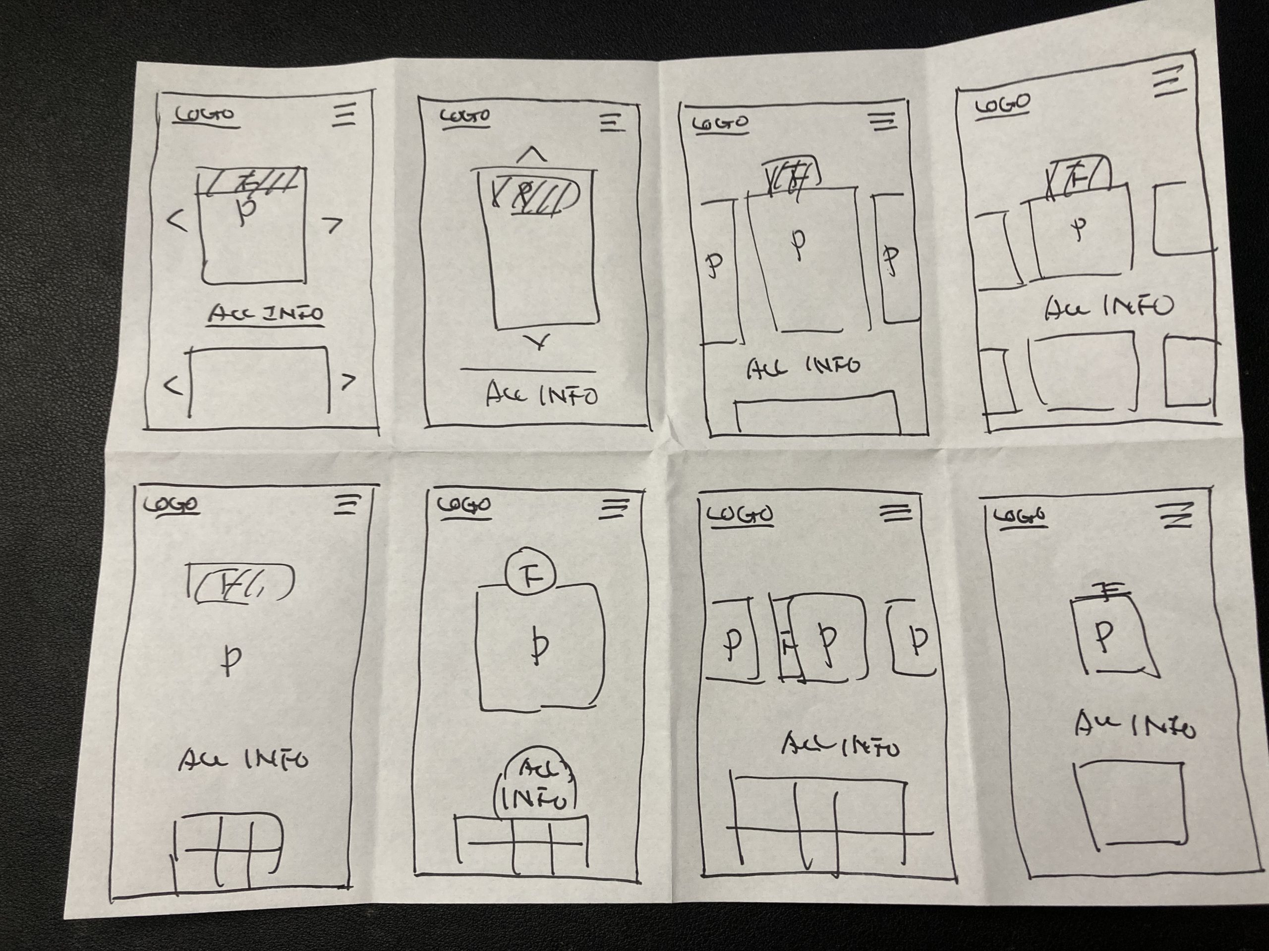
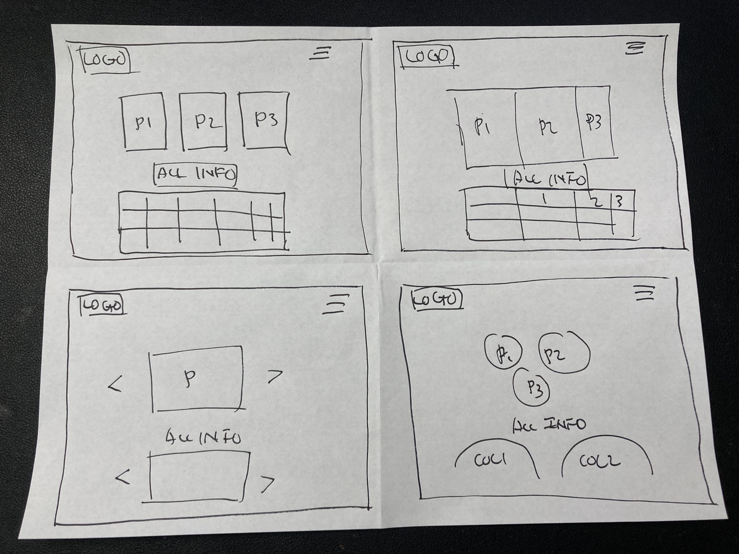
Wireframe Brainstorming
As the team leader and designer, I initiated the first iteration with a basic data structure. However, I and the group quickly realized the need for mid fidelity improvements to prepare for user testing. Drawing inspiration from Asana’s design elements such as clean shapes and rounded corners, I led the team in creating the second iteration.
Usability Testing – Wireframe
Mobile
1. Using this screen, how would you go about reading the page?
2. If you wanted to see all features in a plan, what would you do?
3. What do you think about the add-ons section?
Desktop
1. How would you compare the plans on this page?
2. If you wanted to see all features in a plan, what would you do?
3. What do you think about the add-ons section?
Mobile Concept Design
Desktop Concept Design
Wireframe Usability Test Results
- ✅ Most of our users were able to find the plan they wanted
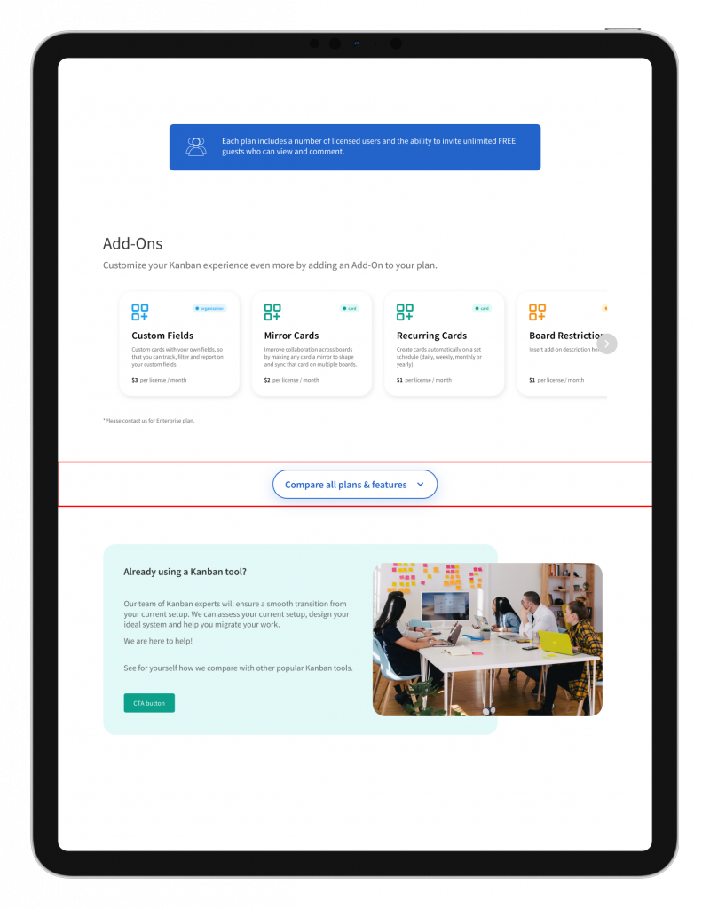
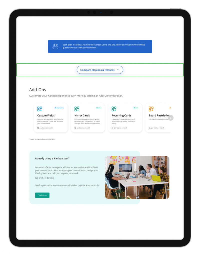
- ❌ The users voiced the add-ons module was confusing for helping them decide which plan was best
- ❌ Users gave feedback the content seemed disorganized, indicating the existing UX content order and structure needed to be improved
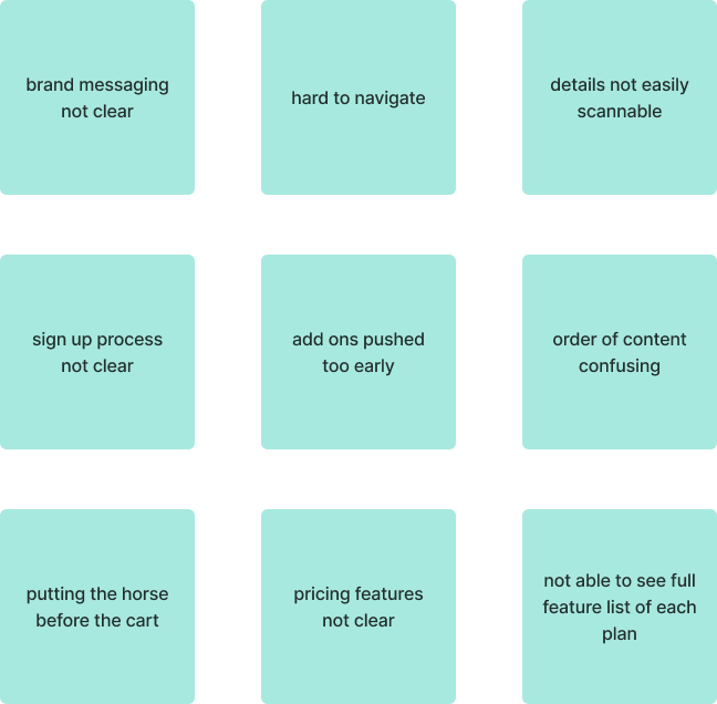
Affinity map takeaways
- users found the order of information to decide on a plan was confusing
- information overload on each plan within the page
- overall the page was not easily scannable for key details
Usability Wireframe
User found add-on module confusing
Usability Wireframe Fix
UX solution to add-on module visibility
Improved Version – moved down further below plans
We presented both the wireframe and usability test to the client to back up our findings.
Client Feedback
After presenting our UX structure to the client, they agreed with our proposed changes but requested that we adhere to the existing color design system. They also suggested that the UI buttons have a similar UX flow, but I encouraged the design team to explore alternative options beyond the standard approach.
Client Requests (Mid-Fi)
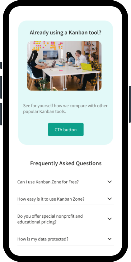
Client Addition – Marketing Module
The client requested the addition of a marketing contact module for users to get in touch with customer reps.
Variation A – use of iconography as a graphic
Variation B – use of imagery as a graphic, client preferred
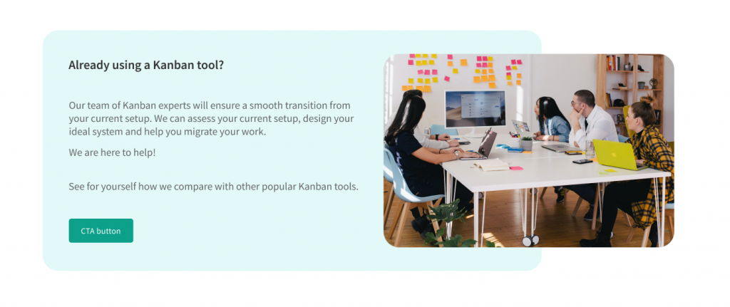
We presented the client with both options and the client favored the image option, variation B.
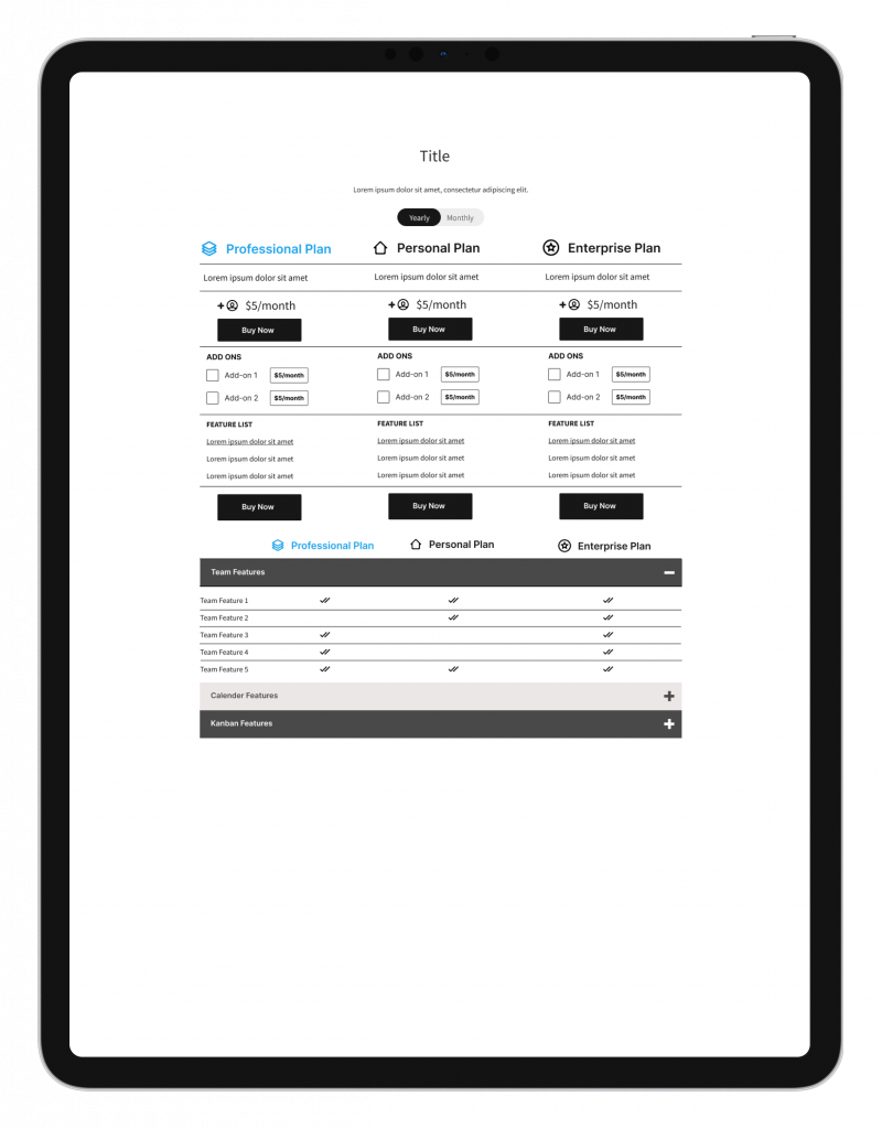
Plans Module Iterations
Variation A – My version
I attempted to modernize the UI from the literal translation of the old page.
Rejected Version
Variation B
Utilizing the Asana UI language keeping the existing UI content
Preferred version
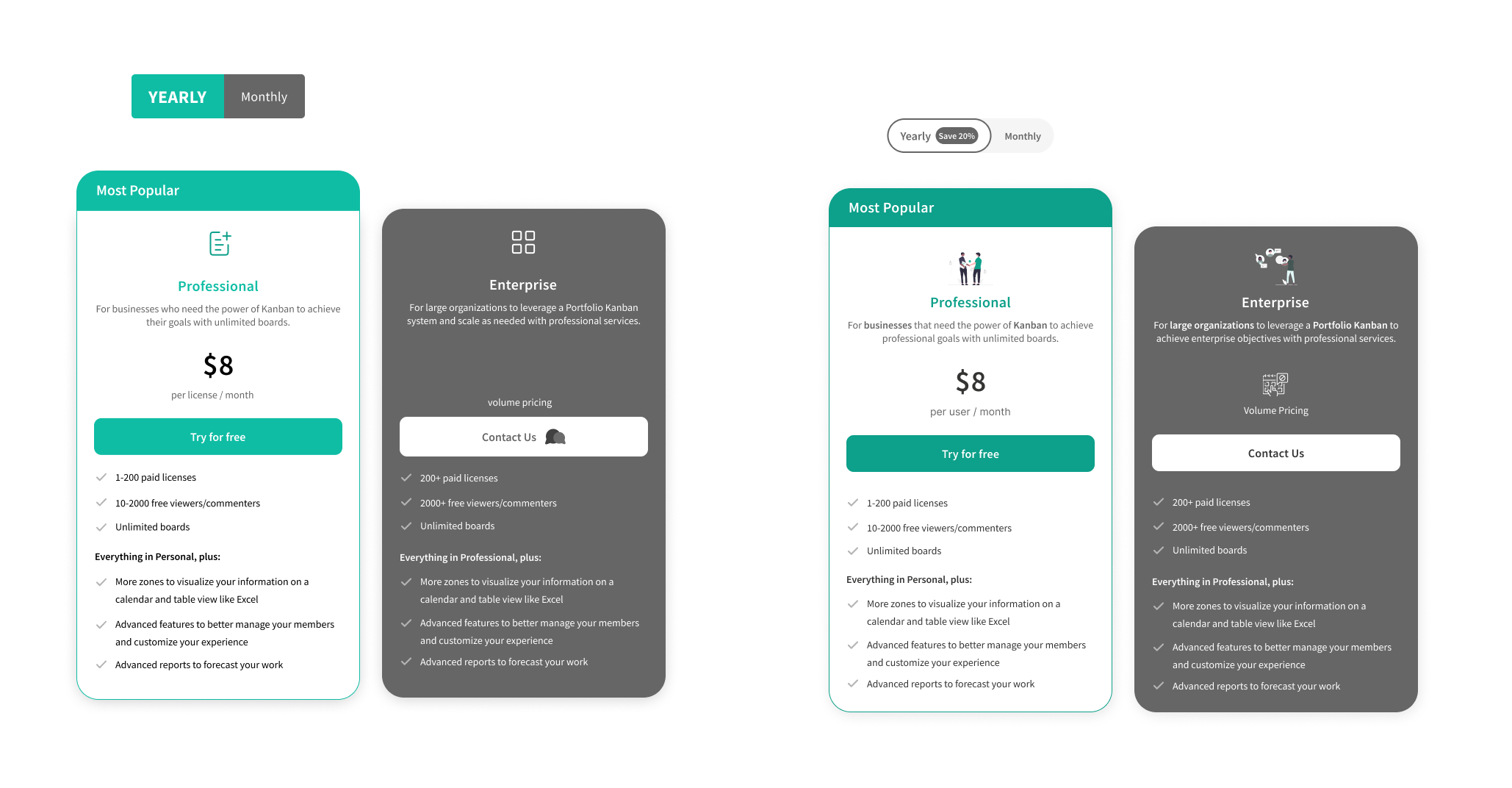
The group preferred variation B keeping the client expectations versus the simplified approach I suggested for the plan frequency toggle (the ‘yearly/monthly’). We chose to go move forward with variation B.
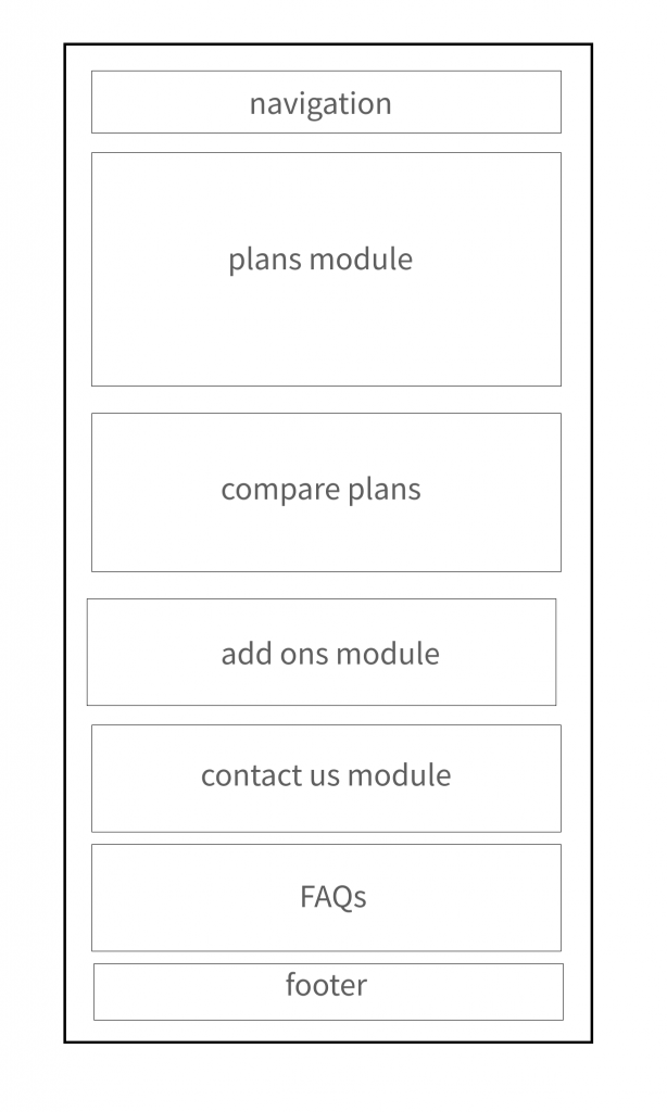
As the project manager and UI/UX designer, I led my team to work on multiple modules of the page based on the client’s feedback from the first round of reviews. I set the page template and created interactive components, while the rest of the team focused on the UI detail work. I also provided guidance and assistance to my team members by sharing my Figma knowledge with them.
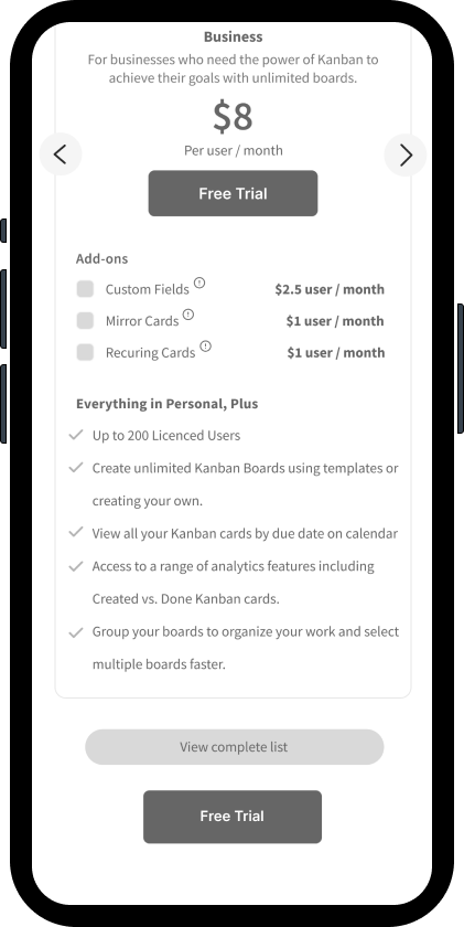
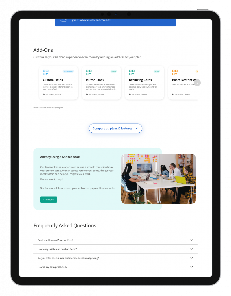
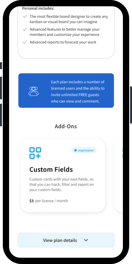
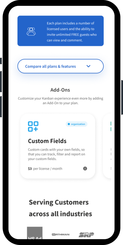
Add On Module Iterations
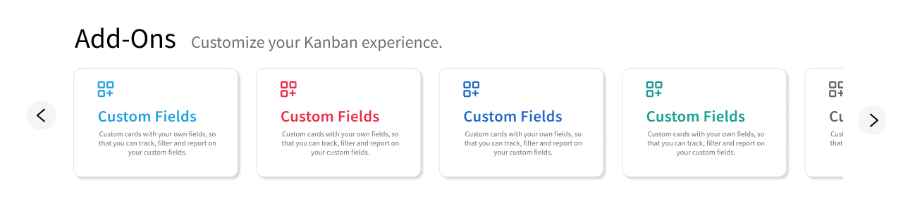
The client increased number of addon card products from 4 to 10 to expand product offerings at the time.
For the best UX solution, we chose a carousel to display the information as addons were a secondary objective and it was mobile friendly via swipe gesture.
Our design team met for a a collaboration session and combined the above changes for the high fidelity design for the usability test below. We all agreed it would produce better results.
Figma AI was used to assist in design systems and rapid prototyping.
Usability Test – High Fidelity Design
First High Fidelity Testing
Testing Script
1. Using this screen, how would you go about reading the page?
2. If you wanted to see all features in a plan, what would you do?
3. What do you think about the add-ons section?
Desktop
Mobile
High Fidelity Usability Test Results
- ❌ Users missed the UX interaction to compare plans
- ❌ Users did not interact with the Add-Ons module
- ❌ Users did report having to scan through which information was the most important and that it was difficult to find the key information upon opening the page
ChatGPT was used to analyze key insights for deep features for user conversion.
Post User Test Changes
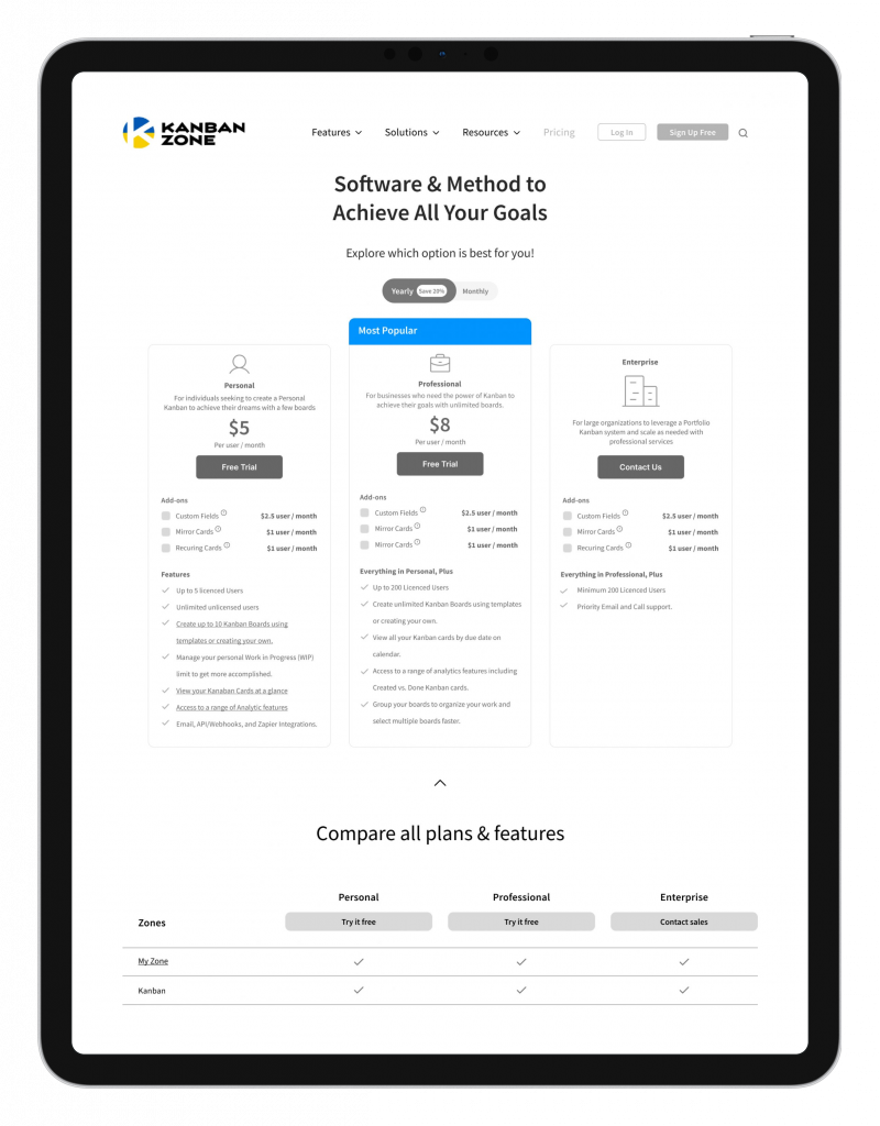
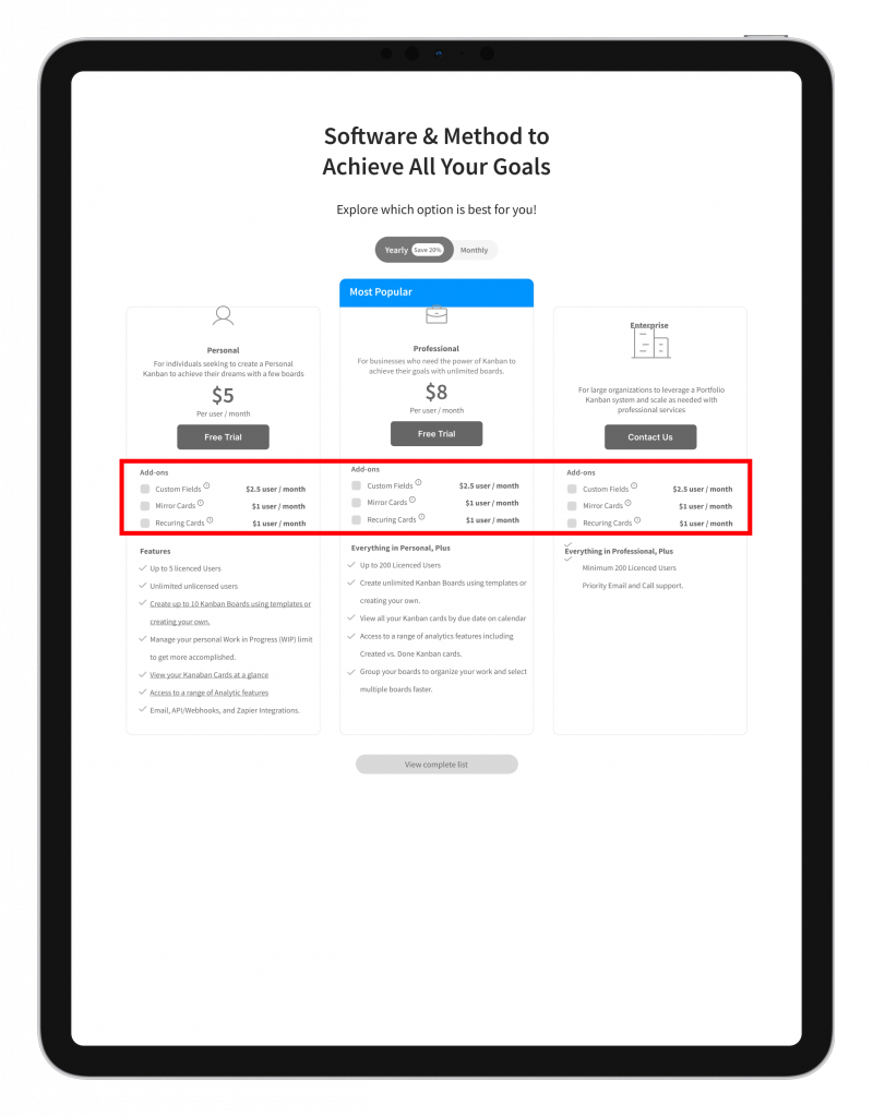
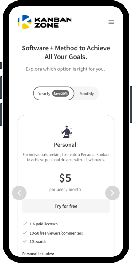
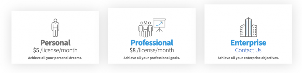
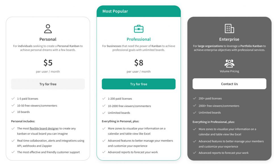
Original
Users reported having difficulty seeing the view plan to sign up for a plan via the Plans Comparisons module (page goal
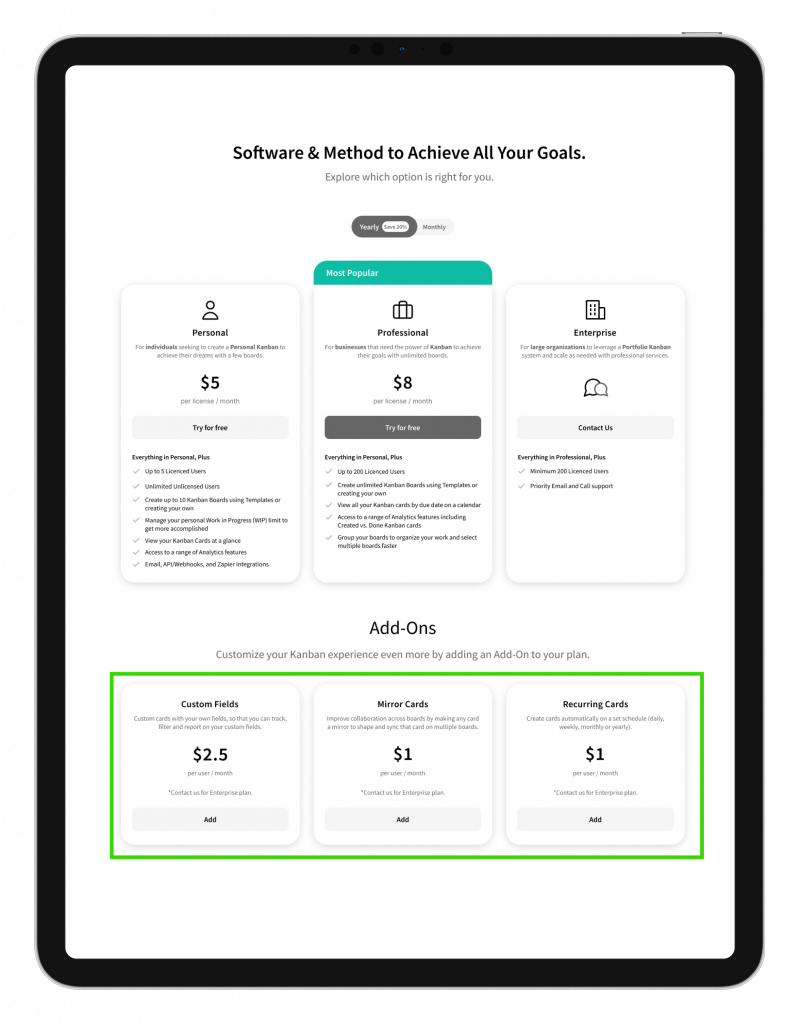
Update
The Plans Comparisons module was moved up so the users could see the features to convert faster
Improved Solution ✅
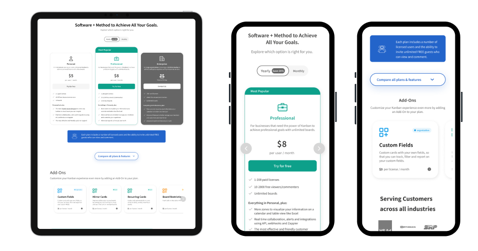
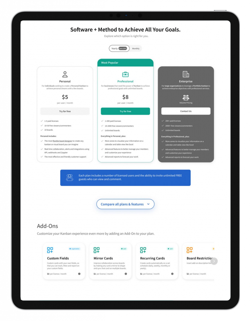
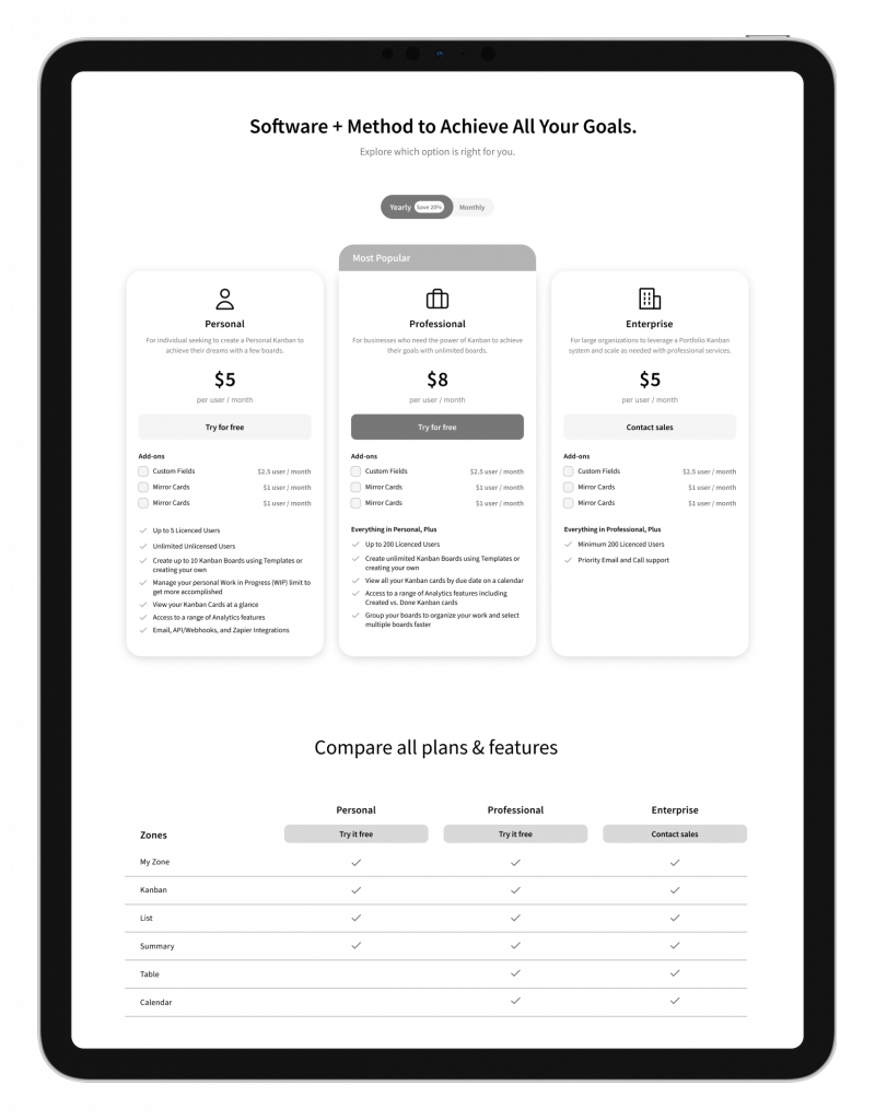
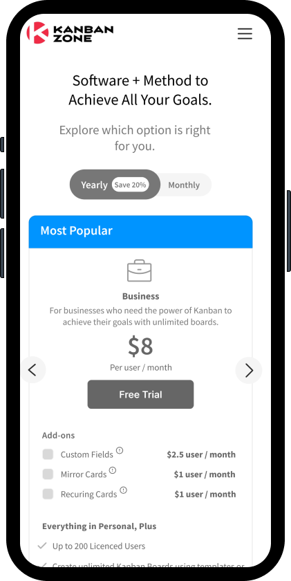
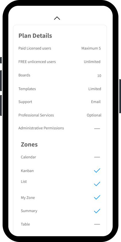
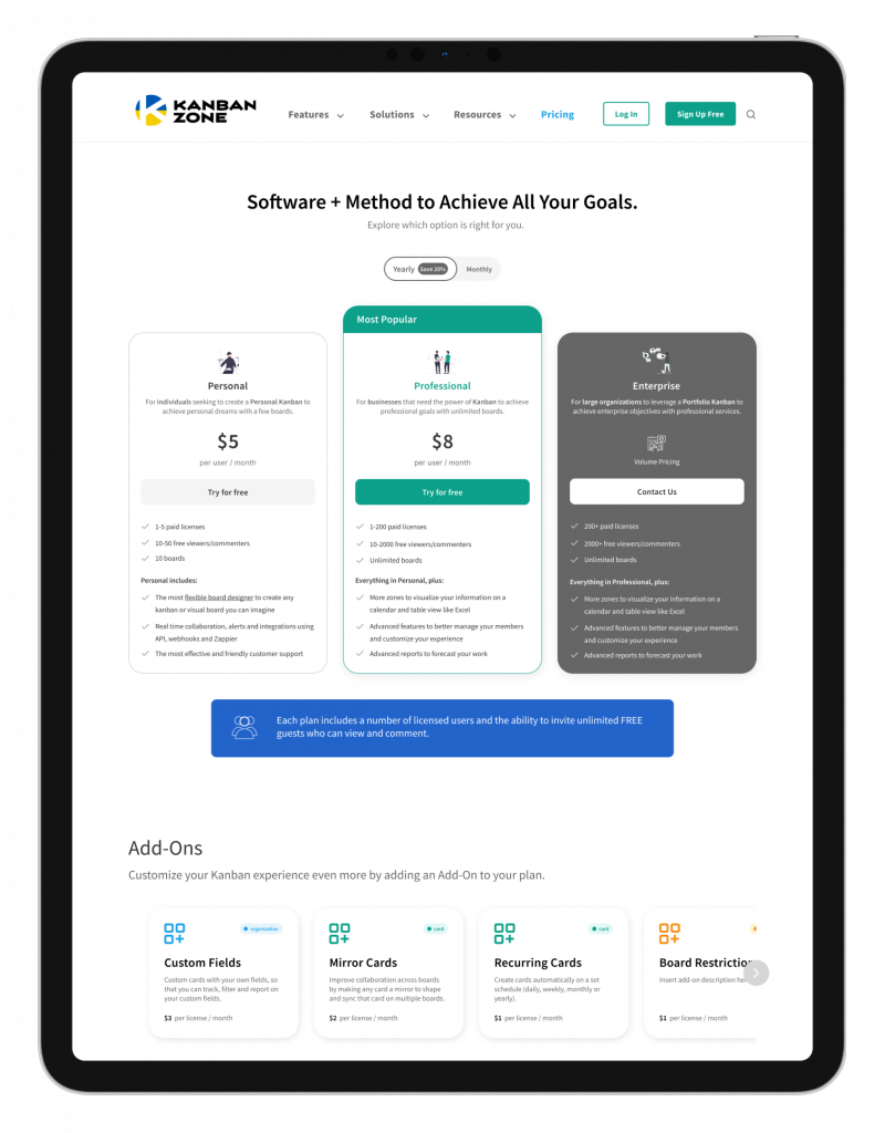
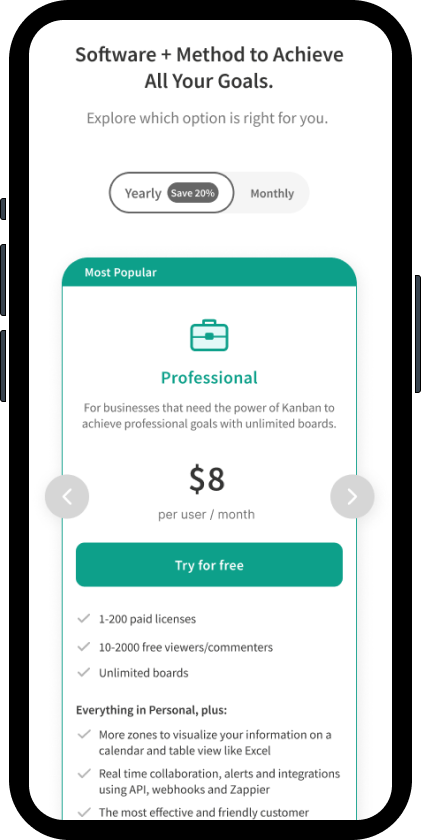
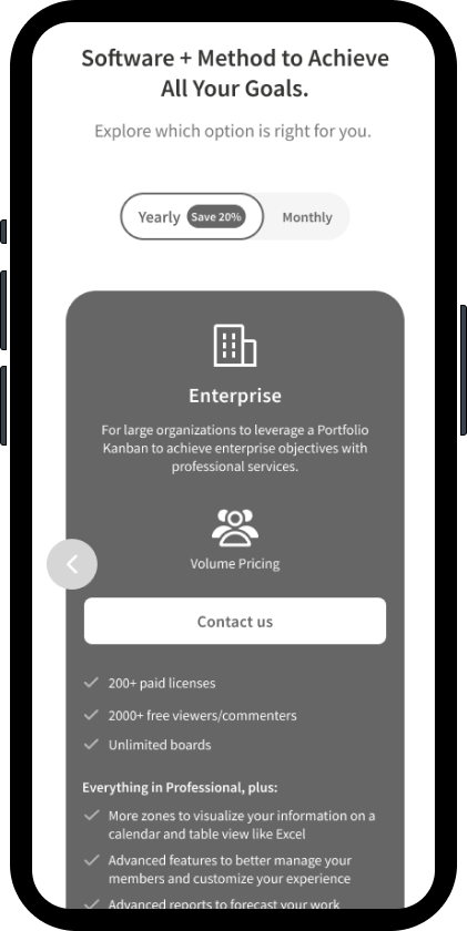
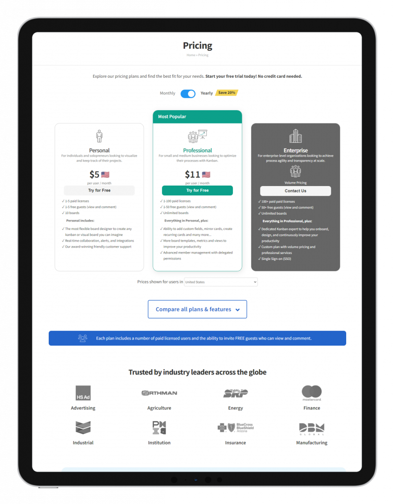
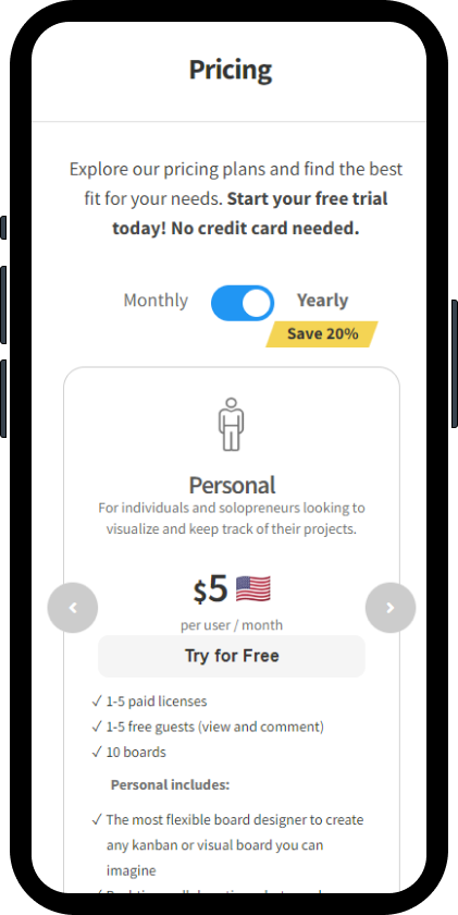
Final Design
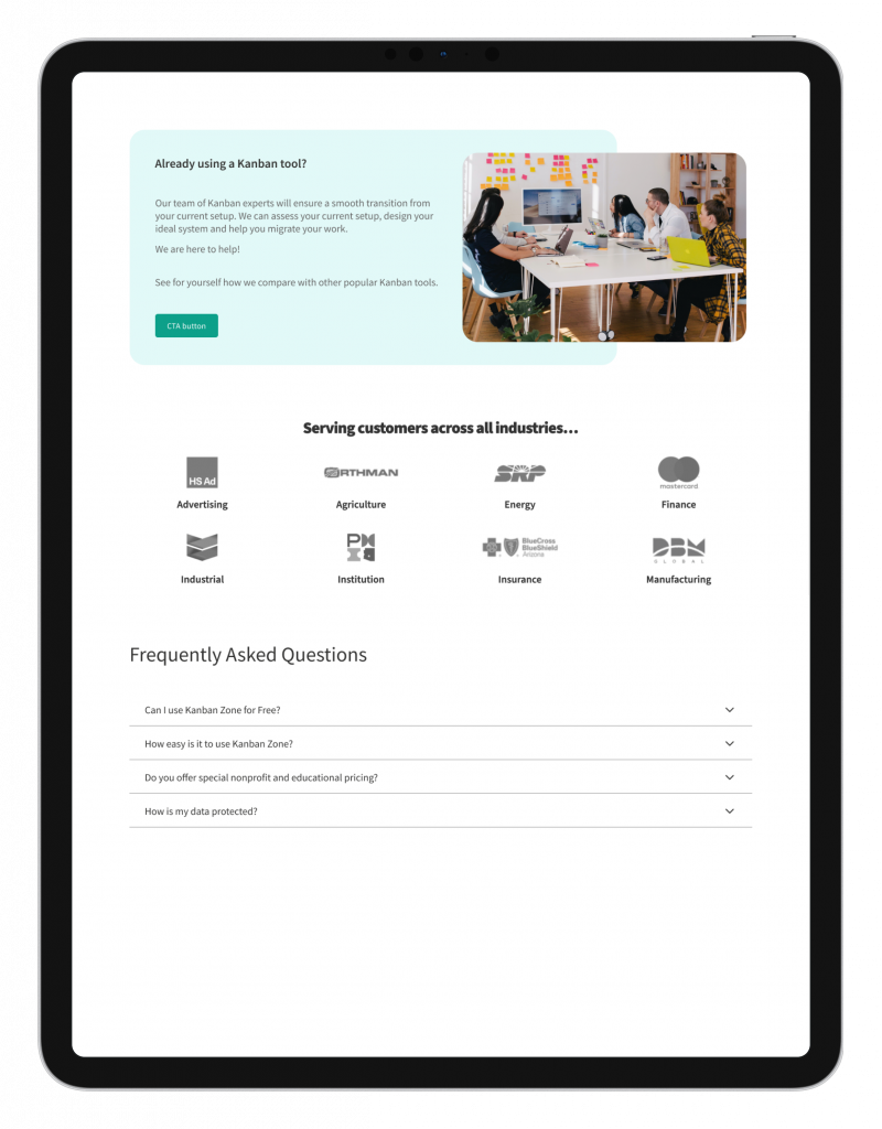
Site Improvements
❌ The existing site has confusing iconography and difficult typography to read
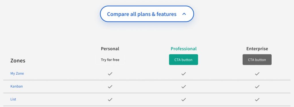
✅ The plans module looks modern and easy to navigate with relevant information.
❌ The existing site has seemingly random CTAs below the plans for UX content organization.
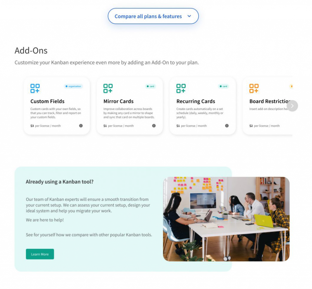
✅ The Add Ons Module is a modern carousel and easily scannable.
✅ Additional CTA callout at the bottom for user conversion.
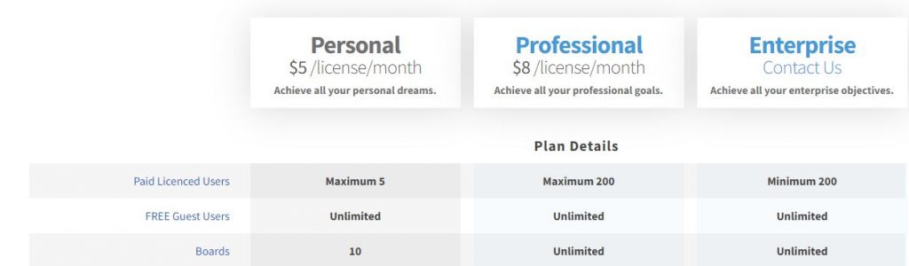
❌ The Plans details gives too much irrelevant information and has poor visual design.
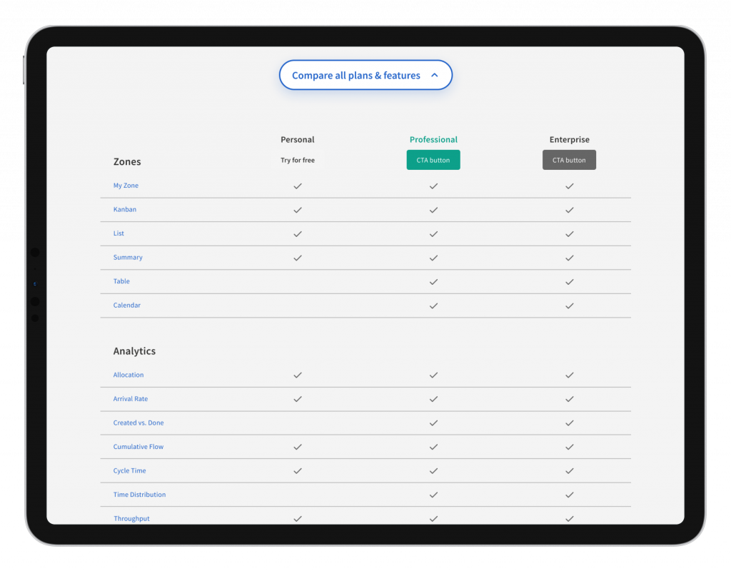
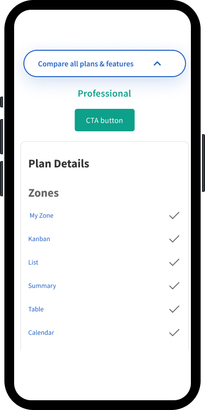
✅ The Plan Details Module is a modern collapsible accordion with key content.
Here is the final deliverable we gave to the client. We incorporated their request for final content and the Kanban design system.
Click to enlarge images.
Desktop

Mobile
Desktop and Mobile Data Accordions
Client Feedback
Initially, the client was hesitant about conducting UX testing, but with the support of our combined UX testing results, they were very satisfied with the design. We maintained the existing design system’s look of the page while giving it a visually appealing modern feeling that was user-friendly while accessible.
Live Product
The client made some minor changes and added some functionality updates (language selector) and the page is live. Subject to change by client since project went live circa 2022.
Outcome
 Increased prodcut signup by 50%
Our design team does not have the exact web analytics, but analytics from App Store downloads and product user traffic reviews strongly indicate conversion increased by 50% and the redesigned page has been very well received with user feedback.
Next Steps
Here are some key takeaways from my experience on this project:
- Leading as a product designer while taking on an extra role was a humbling and rewarding experience. I had to employ user empathy to balance client requests and internal ideas from the team. Through this process, I learned each team member’s strengths and how to leverage them effectively to their own strengths from UX research, UX design, and UI interface tasks.
- Conducting more extensive UX research, including ideation, persona generation, and additional usability testing, would have improved the project. Better UX data drives better UI designs, which ultimately delivers more value to stakeholders and users.
- To further optimize the page after launch, it would be useful to analyze web analytics data to identify engaging content. This data could inform a second design iteration to further increase conversion rates for further improvement.