GoodHealth | Health Management Superapp
MY ROLE: UX/UI Designer
TOOLS: Figma, Miro
DURATION: 40+ hours
Third party disruptor app to combine seniors health needs with fun gamification
Our UX design/research team designed a task productivity app via the IterateUX challenge and I was a lead Sr UX/UI designer.
Problem
Managing health needs is a source of frustration for the elderly. An elderly user has the following health needs:
Medical appointments
Daily Exercise
Daily Medicine Reminder
These needs require the elderly user to use multiple apps or methods to track and can be difficult to manage.
We defined “elderly” as ages between 50-80 for the sake of the study.
Role
I implemented the UX design for the Track Exercise product path, as well as co-lead the UX/UI initiative and served as the project manager for the Figma design file. I assisted in the UX research discussion, helped with the UX design as one of the leads, and helped with some UI design Figma production work.
User Research
Heuristics Research
We evaluated multiple health apps addressing elderly users’ needs, including those from medical providers, third-party developers, and relevant industry apps focused on tracking and gamification, and identified each one’s unique strengths in achieving their business goals. A secondary goal was to find apps that made task processes fun, like Duolingo.
I did the research on the gamification app Duolingo and fitness tracking app Fitbit.
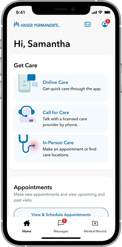
Kaiser
The Kaiser mobile app allows users to manage their health care, schedule appointments, view lab results, and message their care team all in one convenient place.
✅ Notifications
✅ Tests & Appointments
❌ Log Tasks
❌ App not optimized for elderly with accessible needs
Lacks Gamification/Rewards/User Encouragement
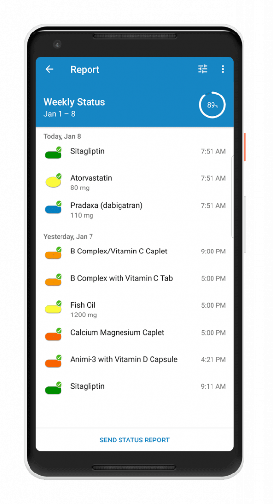
Medisafe
Medisafe is a mobile app that helps patients manage their medication schedules and adherence, with features such as reminders, pill identification, and refill tracking.
✅ Notifications
✅ Log Tasks (Pills)
❌ Tests & Appointments
❌ Manually transfer medications
Lacks Gamification/Rewards/User Encouragement
User Surveys
We asked 25 elderly individuals via survey what difficulties elderly users had tracking their health with Kaiser and Medisafe, and how effective they were.
Did the user make it to the medical appointment?
Did the user take their medicine?
User Interviews
Interviewees felt the current resources with Kaiser and Medisafe it was not enough to fully support the user’s needs and needed user rewards for completing tasks or motivational messages.
(5 user survey participants via zoom online interviews)
 I use my medical provider online to check test results, but I wish it had rewards for completing tasks like taking medication.
There’s lots going on in my life juggling multiple apps – there’s not enough time in the day. Motivational messages via an app can help give me the push I need.
Empathy & Affinity Map
The affinity map based on interview findings in general indicated difficulties in managing health needs and a lack of motivational messages or rewards.
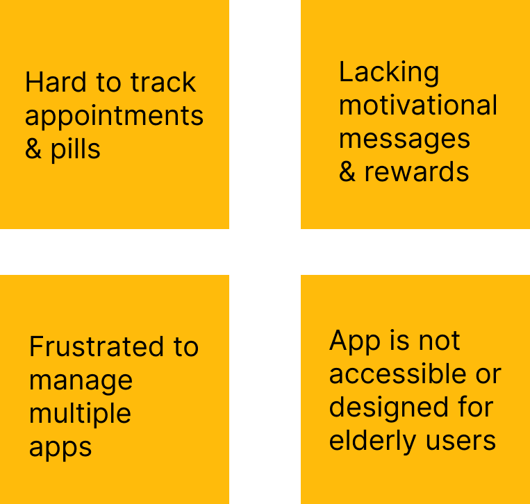
User Needs
Reminder to take medicine
Reminder to exercise
Rewarding user for completion
 Elderly users find it difficult to manage their appointments and are frustrated by the lack of consistency having to juggle multiple systems.

Name: Barbara C
Age: 59
Digital Literacy: Low
Barbara is pre-diabetic, has high cholesterol, and has been given doctors orders’ to exercise. She has to monitor her blood sugar levels and needs daily medication for her condition. She takes care of her grandkids on top of a busy schedule as a working teacher.
“I would like an easy way to manage appointments and reminders to keep active during my busy day.”
Motivations: Stay healthy in her older age to see her grandchildren grow
Frustrations/Pain Points:
- Finding time and motivation to exercise
- Forgetting to take medication/vitamins
- Overwhelmed with how to stick to their diet plan
Journey Map
Superapp Research Proposal
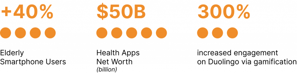
Market research shows a gamified superapp to combine all the elderly users’ needs would be sustainable and transform the health industry to capture the elderly mobile userbase.
Here are the improvements we recommend for the UX user journey and UI experience in our proposal.
Accessibility for elderly/disabled users for easy visual usage with standard features like larger text, high contrast, and text to speech.
Monitor health with features like logging pills taken, doctors appointments, and daily exercise all in one location in the application.
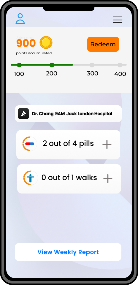
Gamification to make the experience fun of maintaining your health with rewards that you can redeem with local partners like Starbucks.
Ideation
Superapp to help elderly with multiple key goals
MVP 1
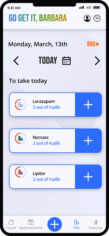
Log medicine & Appointments
MVP 2
Log exercise
MVP 3
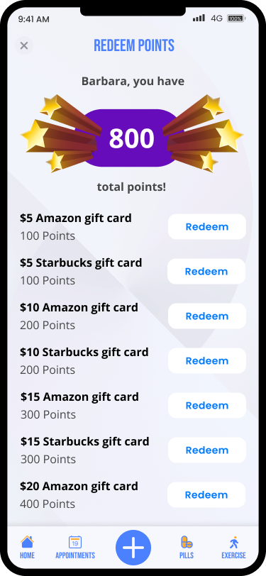
Redeem points
Wireframe Brainstorming
Each designer on the team created their own UX flow for their product path (Profile not shown).
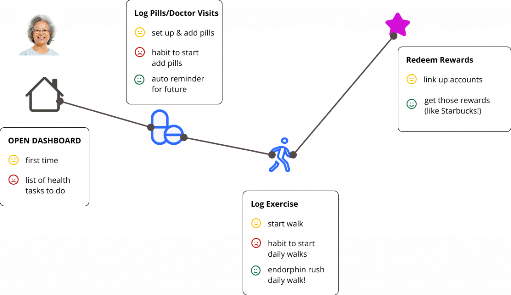
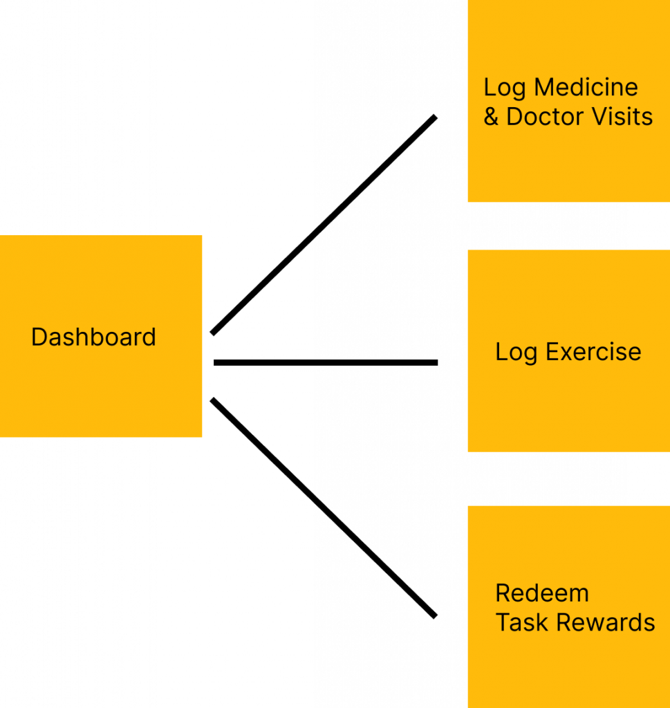
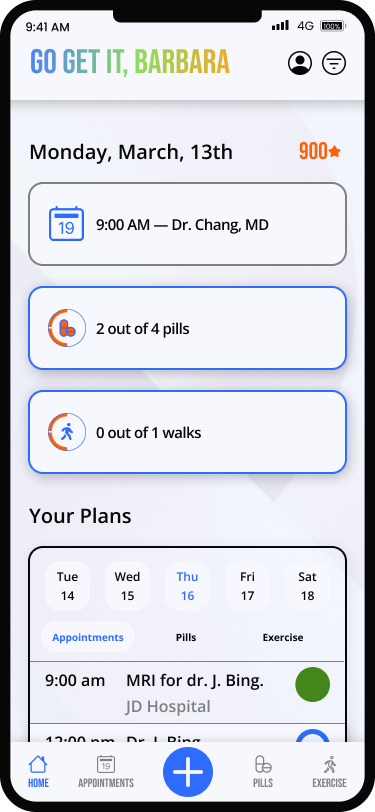
Dashboard
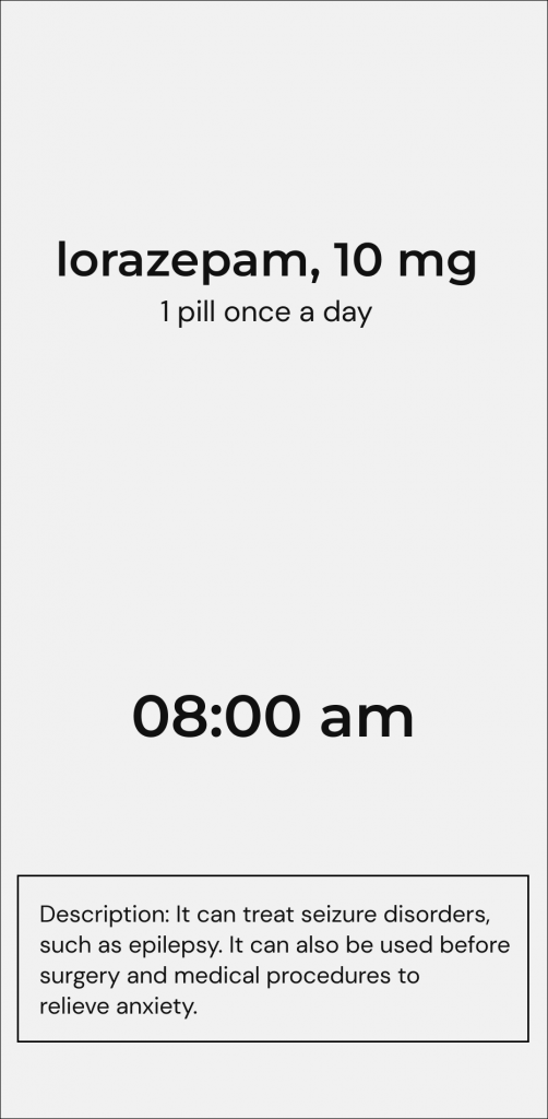
Log Medicine/Doctor’s Visit

Redeem reward
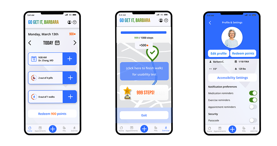
My MVP was Track Exercise.
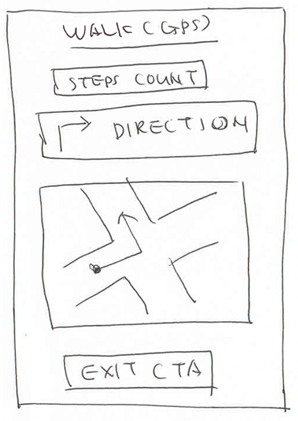
The Track Exercise uses a Google Maps GPS style navigation to guide the user on their walk.
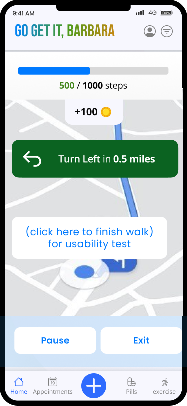
High Fidelity version of Log Exercise
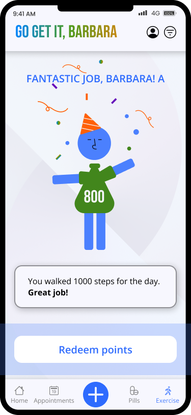
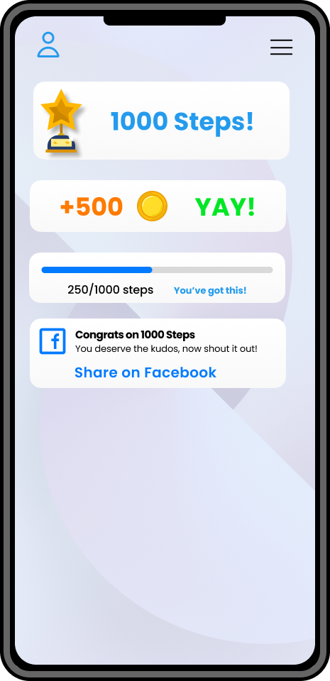
Users are rewarded with sponsored monetary or point-based monetary reward for their exercise task
Mid-Fi Wireframes
UI Brainstorming & Iterations
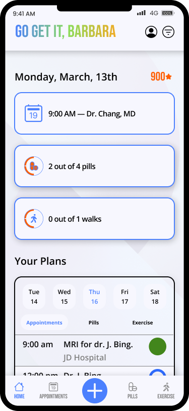
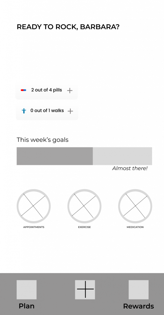
The dashboard has a combination of daily tasks with a weekly view with details.
This was not well received for being complicated.
This dashboard variation uses simple design language, bright colors, and clear CTAs using simple goal data trackers.
We rejected this for being too simple.
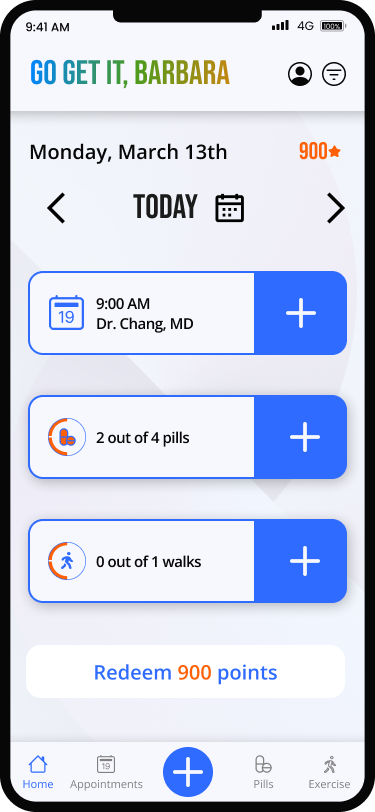
This dashboard variation highlights rewards(like Starbucks) and shows tasks for the current day. Modelled after Fitbit.
We chose this to move ahead.
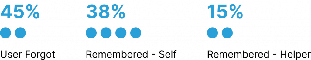
Mid-Fi Wireframe Usability Testing
We asked 5 users to complete the 3 tasks below via unmoderated testing over Zoom capturing their screens during the process. Most users succeeded and we identified the follow issues via user feedback/observation.
Log medicine
✅ 70% PASS
Log exercise
✅ 70% PASS
Redeem points
✅ 60% PASS
With the existing test screen, users felt overwhelmed with the numerous CTAs on the dashboard and felt it was difficult to use.
This iteration fixes user issues with large visible CTAs and a simplified calendar navigation.
I lead this redesign initiative to improve the user experience.
Based on the failure rates, we simplified the user interface to be easier for seniors and made colors accessible.
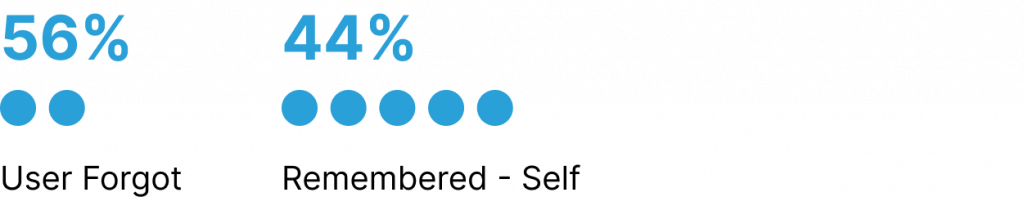
High Fidelity Usability Testing
We wanted to test variations on 2 questions so we implemented A/B testing on the prior Hi-Fi Usability Test.
I lead the initiative for A/B testing based on my team’s split design opinions.
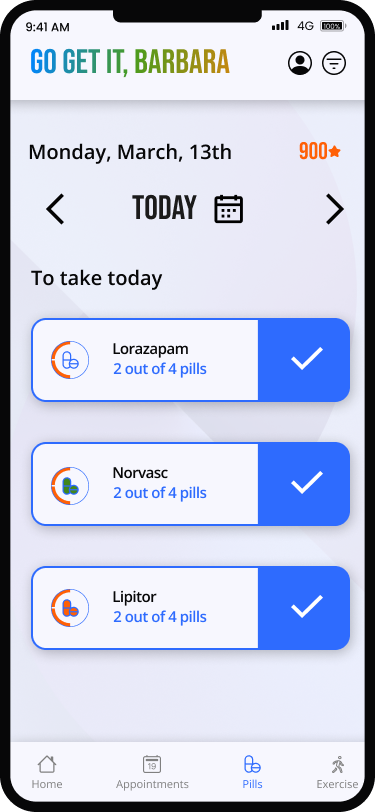
1. Does the + button on the taskbar useful to the user?
2. Does the checkmark UI work better than the plus UI icon on logging tasks? (designed by team member)
Version A
Control Test
- Has the plus “Add Task” – control
- Has the plus “Add Pill” UI – control
This was chosen as the better one in user testing as the “+” CTA was more clear for use.
Version B
Experimental Test
- Lacks the plus “Add Task”
- Has the checkmark “Add Pill” UI
We asked the users to complete the 3 tasks below via unmoderated testing over Zoom capturing their screens during the process. Most users succeeded and we identified the follow issues via user feedback/observation.
Log medicine
✅ 80% PASS
Log exercise
✅ 80% PASS
Redeem points
✅ 90% PASS
| Checkmark CTA (version B) did not perform well | Use Plus symbol CTA(version A) for final design |
| User has difficult redeeming points | Add Redeem CTA at bottom of home screen |

Final Design Changes
1. Used the “+” for the CTA on UI modules
2. Added a Redeem CTA at the bottom of the page as a catch all for redeeming points.
High Fidelity Designs
Main Screens
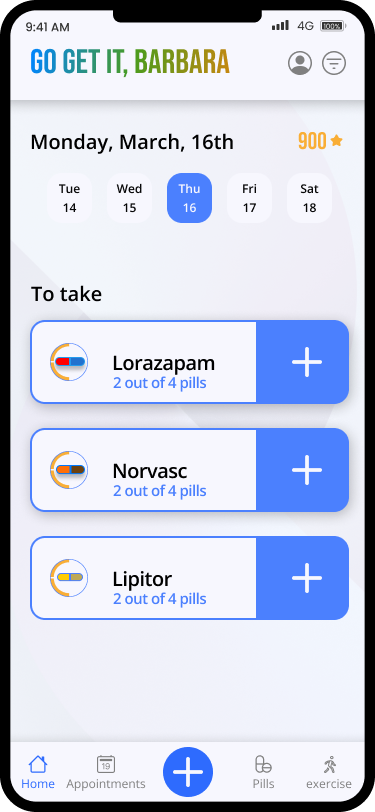
Home / Dashboard
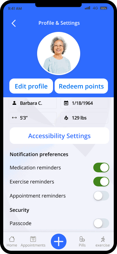
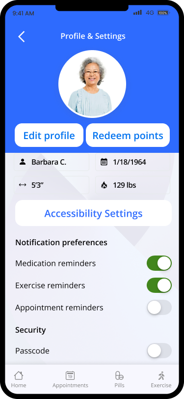
Accessibility Options
MVP Tasks
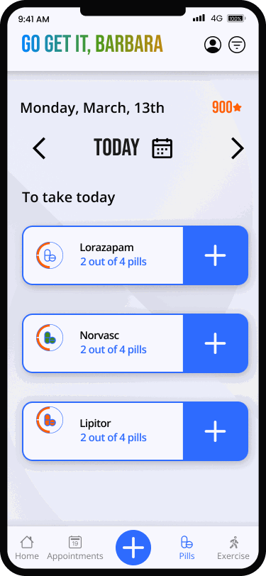
Log Medicine/Appointments
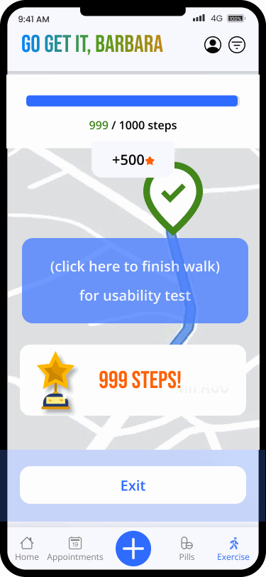
Log Exercise
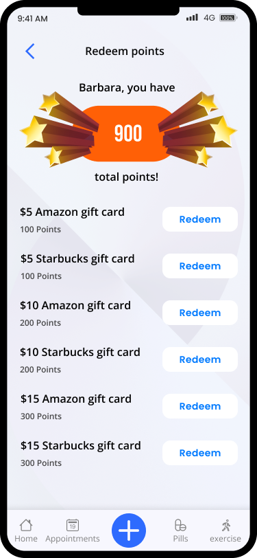
Redeem Rewards
Lessons Learned & Next Steps
1. As one of the UX designers, we were not familiar with the user demographics and initially overdesigned the UI and overcomplicated the UX flow. Rounds of testing and feedback helped us establish a simple design system for the elderly user base in mind for accessibility.
2. Collaboration with our design team and each of us alternating leading or co-leading the team led to a better product, but at times it lead to increased production time given our different time zones across the country (US).
3. There are many real-life financial and industry political challenges that may be involved in implementing this design, so I think a second iteration involving actual stakeholders would lead to a different product than this case study can produce and would be more realistic.