
Canon | User Friendly Camera UX System
MY ROLE: Sole UX/UI Designer
TOOLS: Figma
DURATION: 250+ hours
better UI for increased product retention
This is the student capstone project I completed for my Springboard UX Bootcamp.
Problem
Canon’s new mirorrless cameras offer innovative features but increasingly difficult to use. This decreasing customer product retention and reduces motive for existing Canon customers to purchase camera products.
Role
I was the sole UX/UI designer on this individual project as this was a passion of mine. I built out product requirements, gather user research, iterated on UX flow, and designed the final UI product interface.
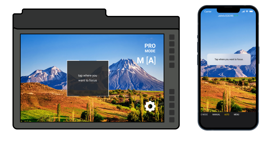
Product Demo
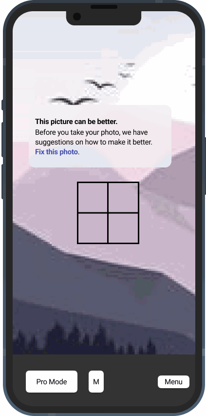
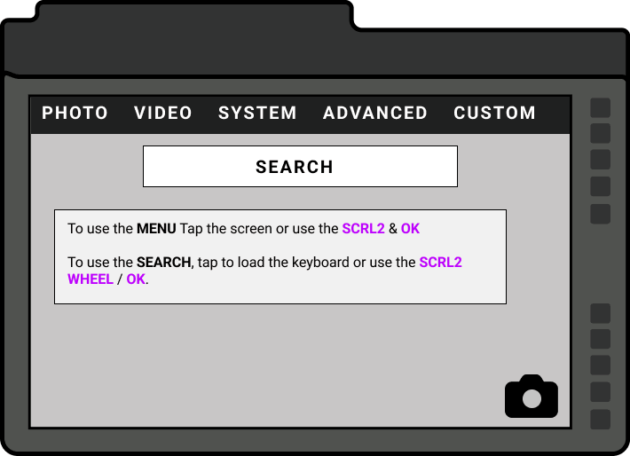
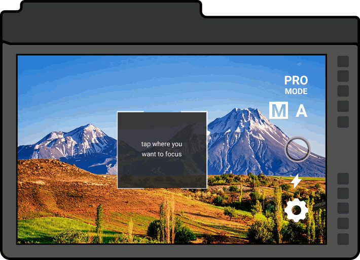
Current
- The touchscreen UI is very confusing to use as a menu
- The buttons are far too close and difficult to use.
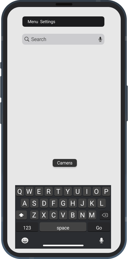
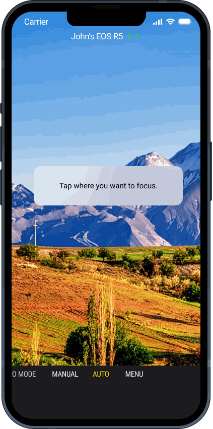
The same applies for the mobile product below.
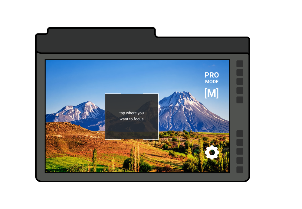
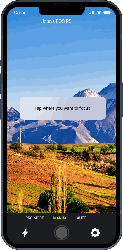
Proposed
This beginner simplified layout gives the user a better introduction user experience first before transitioning them to the full interface.
The same applies for the mobile product below.
User Research
Internet Research
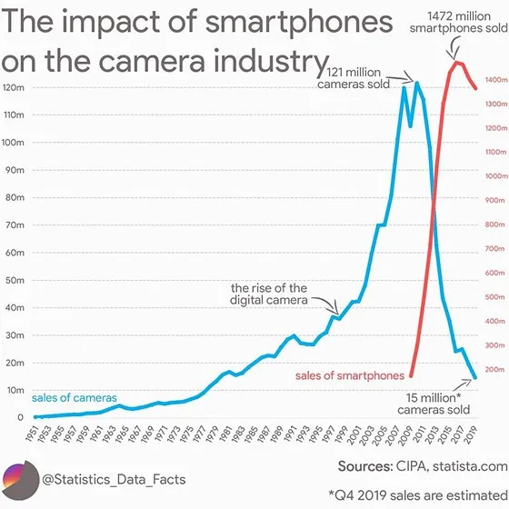
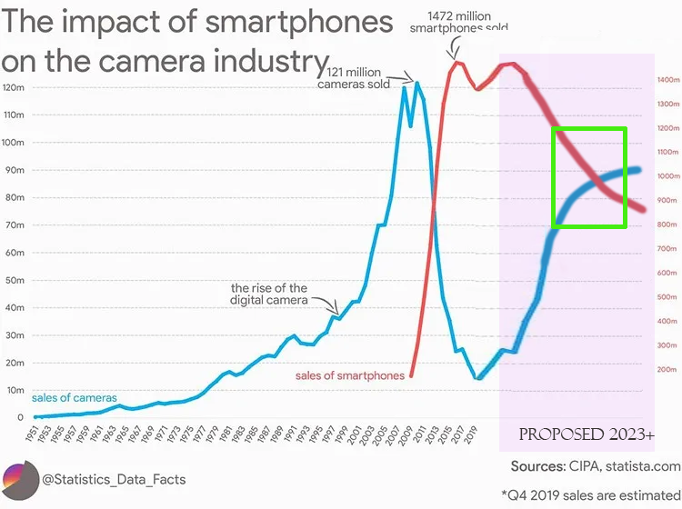
To combat the rise of mobile devices and loss of digital camera sales, digital camera product capabilities have been increased. However, sources indicate that while the capabilities have been increased, the accompanying user interface is outdated and has not caught up. This suggests users are frustrated with their cameras.
I am tracking the purchase quantities as the UX metric for this case study.
Camera sales decreased as mobile device sales increased.
The product is unsuccessful converting the market for a majority of users.
Industry Analysis

I evaluated Canon, Nikon, Sony and Fujifilm via the Nielsen 10 UX metrics. They are industry leaders and comprise a majority of the market share for digital cameras
The primary method the users uses for the product recall instead of recognition – items are not clearly labelled and the user has to memorize their location. All four cameras received a 2 out of 5 rating which indicates poor usability.
User Surveys
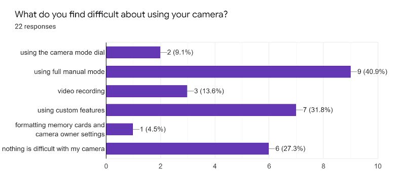
*survey is taken from 20+ camera beginning to intermediate users with mirrorless cameras
- Users also found it difficult to capture a clear picture with their camera
- Users found manual mode hard to use as a beginner
- Users found cameras have too many controls as a beginner
User Interviews
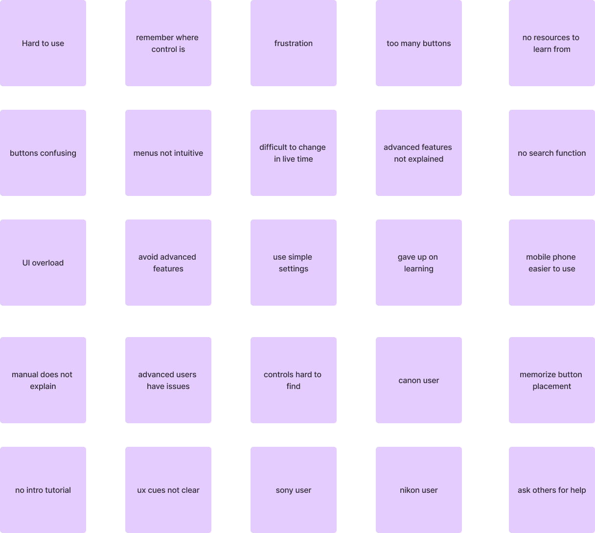
I conducted Zoom interviews with select survey users to ask what specific issues they had with their camera.
I found a direct correlation between user frustration with the product and negative product retention.
 Separating it by category like putting autofocus options all in 1 tab for easy recognition.” – Grace W.
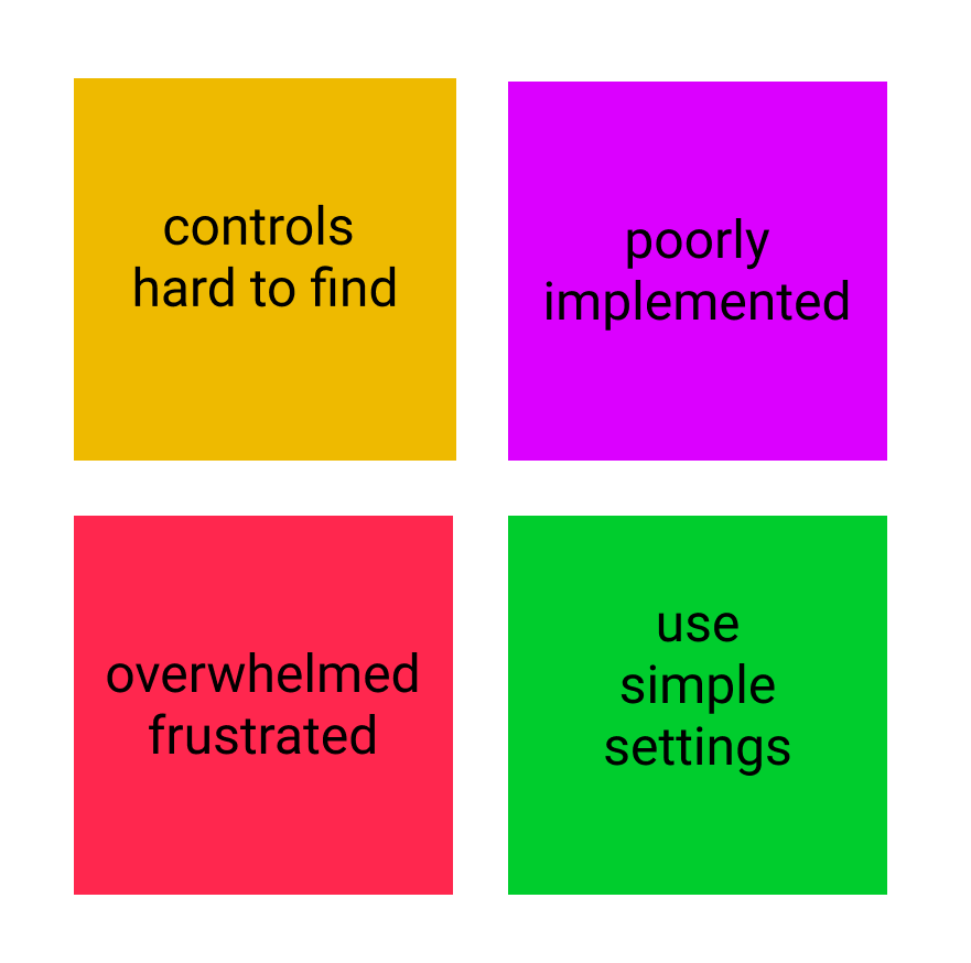
There are a lot of manual and advanced settings, but they are poorly implemented or hard to find. I just stick to simple settings to get the picture I need instead to calling it a day.” – Pohan C.
A common pattern is users found advanced functions hard to use, product information is poor, and menus are poor implemented
User Personas
From the data synthesis, I was able to brainstorm the personas below.
Click to enlarge full personas below.
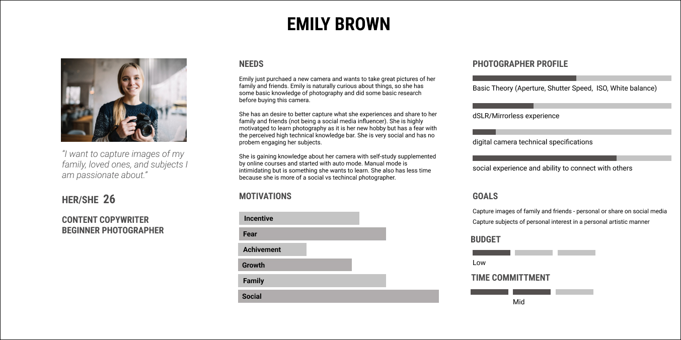
Emily
User is a social person who uses it to capture their life. Just taking social pictures for social media. She wants to capture creative photos beyond the limitations of her phone.
This is the main persona used for the product design.
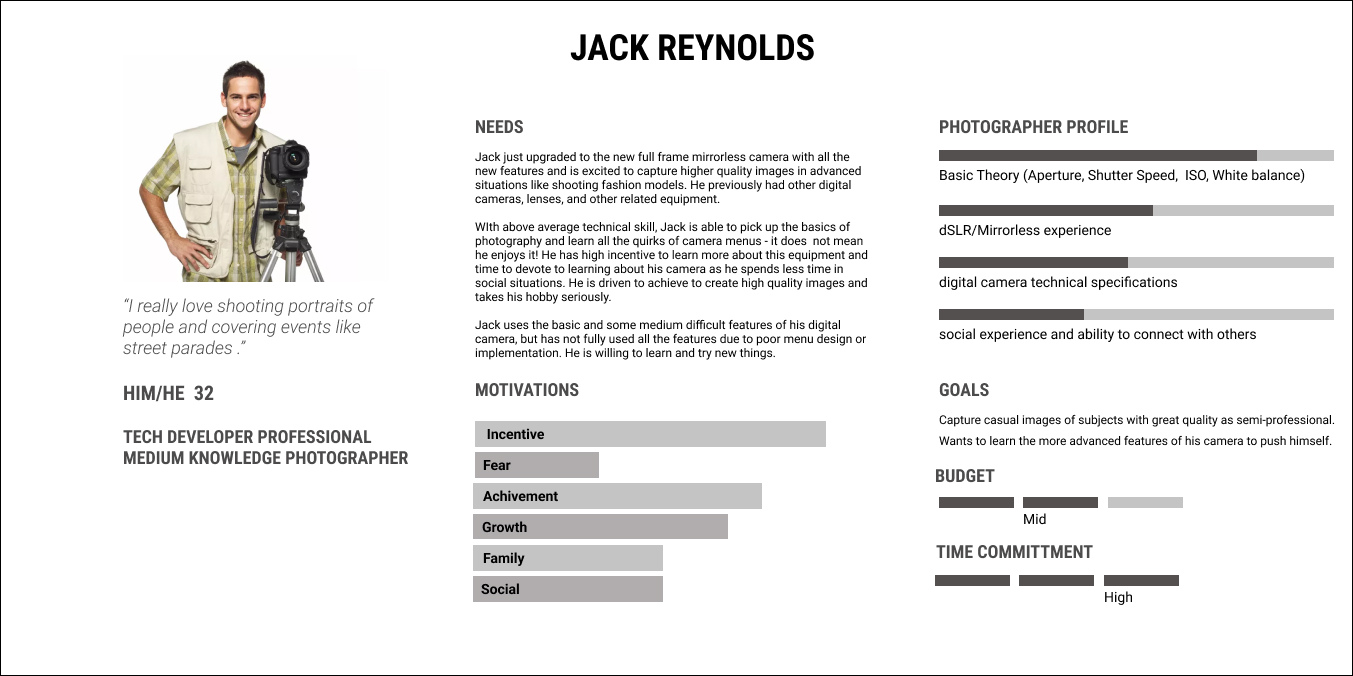
Jack
User is semi-advanced but not professional. Wants to take better photos and learn advanced features. Likes to shoot specific subjects like night sky (astrophotography).
This persona introduces secondary design product goals.
User Journey
Based on the interview data, I created an affinity map and user synthesis to guide our approach.
Our MVP focused on allowing users to learn the camera as a beginner and gradually transition to using the pro mode. This is a workaround, given that that Canon will redesign their user interface not at this time given the business cost.
 How might we make the camera experience intuitive for the user?
How might we encourage the user to explore advanced camera features?
Ideation
Solution
Our strategy is to increase customer product retention by providing a simplified user experience through guided tutorials that educate users about the camera’s basic features.
The user is given the option switch to the existing (challenging) user experience once they feel comfortable using our simplified UX solution as a bridge solution.*
* Unrealistic to expect the business to overhaul the existing UI to be user friendly in the short term
- The MVP solution involved emulating the touchscreen of a smartphone camera using common UX mobile flow
User Camera Journey
Based on the “Emily” persona, I mapped a user story to establish expectations for the flow for what Emily wanted. This clearly defines the user’s goals with the digital camera and reflects their motivations.
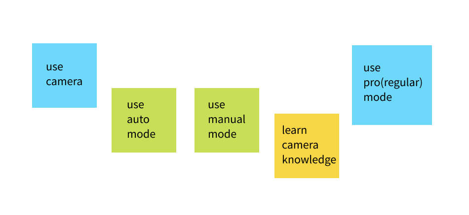
MVP Goals
I. use my camera
II. learn photography basics
III. switch to advanced mode
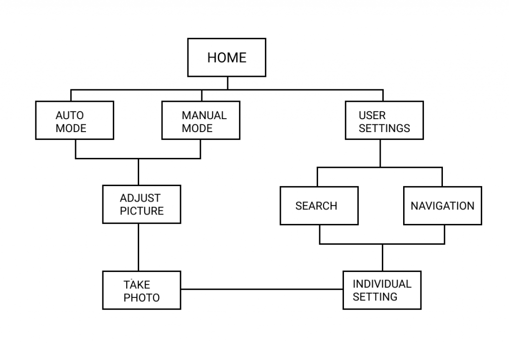
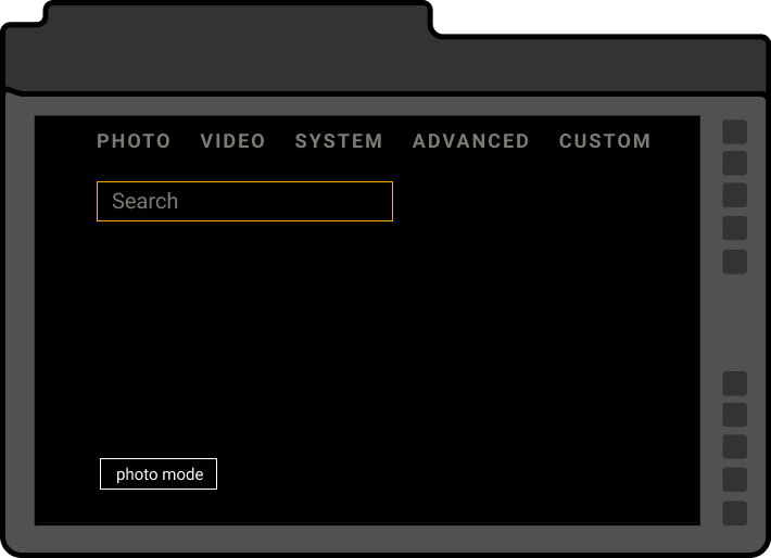
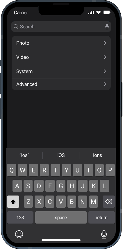
Product Routes
This user flow is designed based on the user journey to illustrate how the user can take photos and make changes to the camera settings.
use auto mode
use manual mode
change user settings
Ideation Sketches & Testing
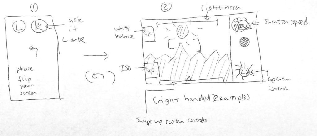
I sketched out the UX flow for the MVP product route and tested this flow with users.
User test prompt
1. Take a photo.
All users were able to complete the task without error and found the UX flow easily understandable.
* All tests were done over Zoom video call using simulated devices
Wireframes
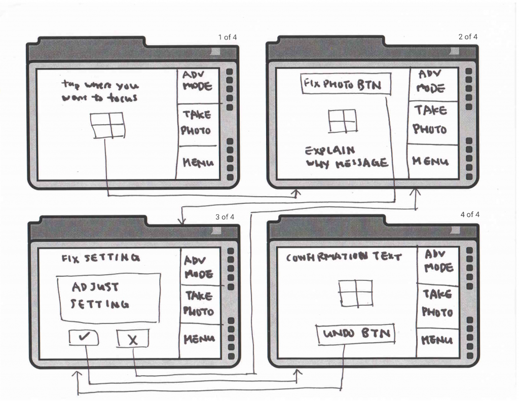
Mid Fidelity Wireframes & Testing
- The Auto and Manual modes tutorials follow common mobile UX design patterns
- All UX flows are based on existing ecosystems (Canon, iOS) and UI based on their existing design systems (Canon, iOS)
User test prompt:
1. Take a photo in Auto mode
2. Take a photo in Manual mode
3. Change camera settings
Take a photo (Auto)
Change Settings
All users were able to complete the task ✅.
* All tests were done over Zoom video call using simulated devices
- some users were frustrated with the lack of user control during the guided tutorials via skip button as they had already understood the UX experience
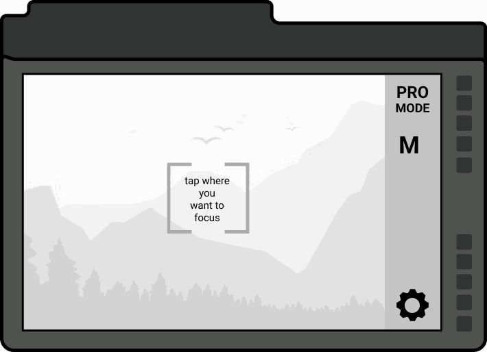
High Fidelity Design
Iterations – Manual & Auto Mode Switch
Confirming positive results, I translated the wireframe designs into high fidelity designs for another round of user testing.
Variation I – Tap to switch
I chose a UI where user has to tap the active mode to switch modes, but realized later this was not intuitive.
This variation was not used.
Variation II – All modes selectable
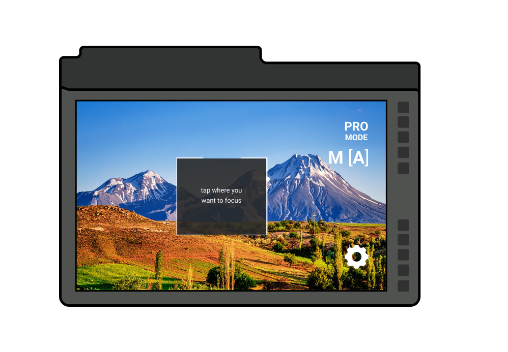
I chose to show all modes where the user could pick from, and use the [ ] to indicate the mode they were in.
This variation was chosen.
High Fidelity Usability Tests
High Fidelity Design Test I
Using the above designs, I conducted 5 tests with new users.
* All tests were done over Zoom video call using simulated devices
User test prompt:
1. Take a photo in Auto mode
2. Take a photo in Manual mode
3. Change camera settings
Take a picture (Auto)

Change Settings
Results
All users were able to complete the tasks✅ without any errors and found the UX flow to be highly usable. However, I still encountered challenges in achieving consistent results for the secondary task switching between manual and auto mode❌.
- Users found the switching between manual and auto mode confusing, and pointed out that the visual representation of the current camera mode was unclear.
High Fidelity Design Test II
Based on polarizing user feedback about the confusing camera mode UI indicator, I decided to try using a faded out UI state to indicate the active mode instead.
* All tests were done over Zoom video call using simulated devices
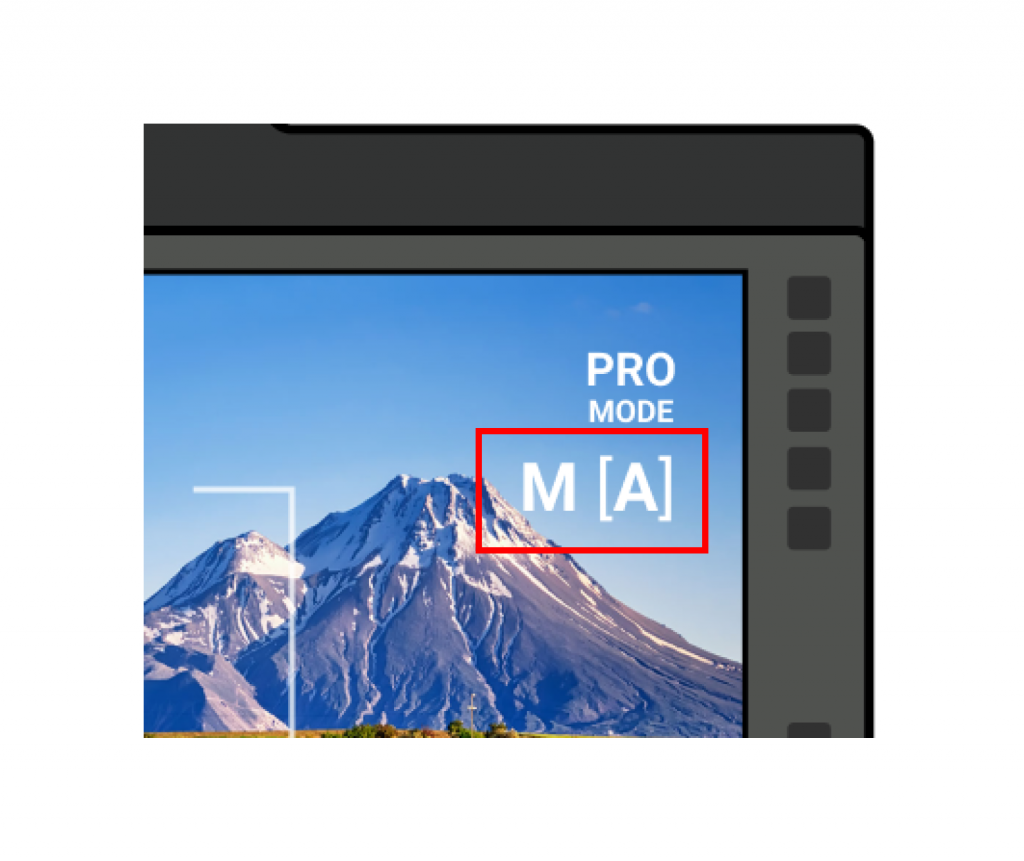
Version I
the [A] is unclear it is in auto mode with the bracket
Users found this confusing. ❌
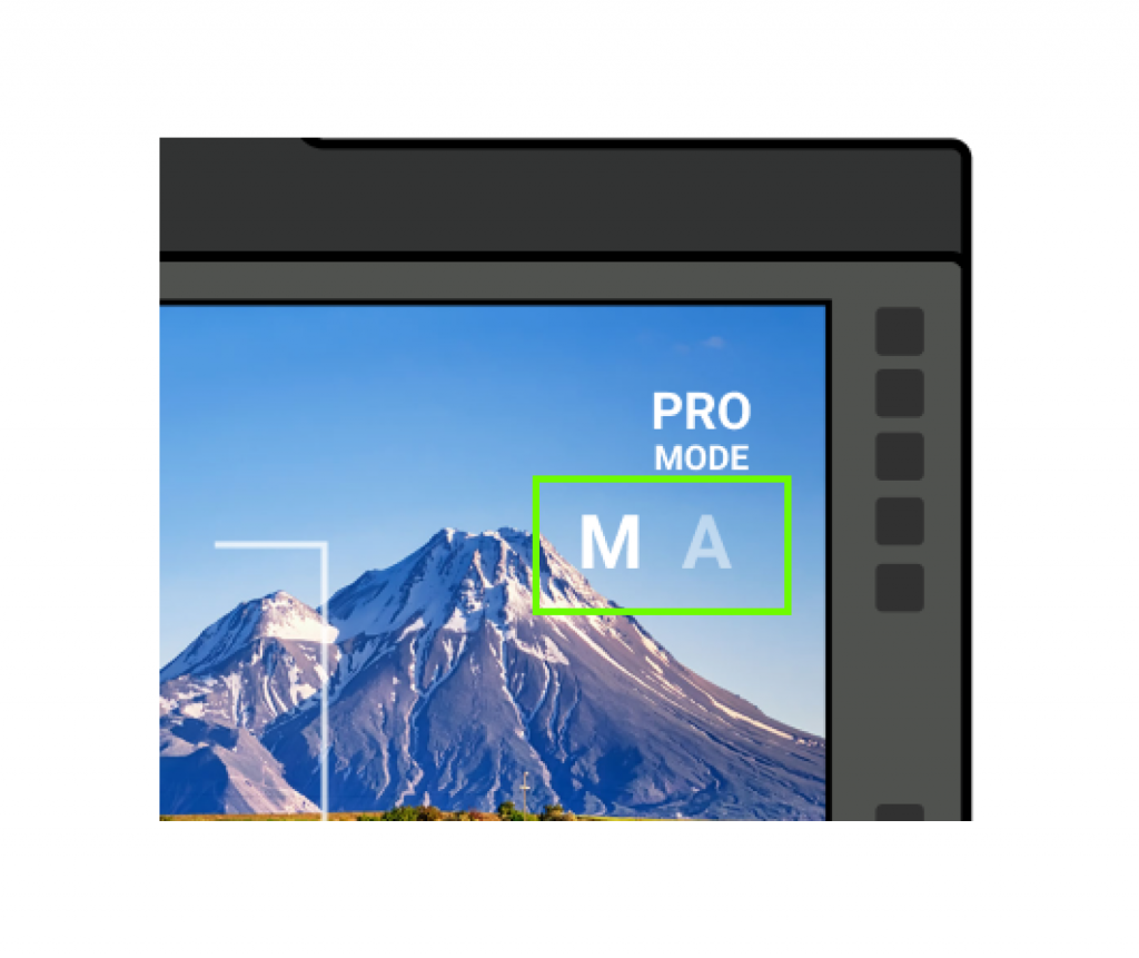
Improved Version
the “A” is grayed out to indicate it is active like digital camera UX language
This was implemented in the design. ✅
I used the above designs for testing. I conducted 5 tests with new users.
* All tests were done over Zoom video call using simulated devices
User test prompt:
1. Take a photo in Auto mode
2. Take a photo in Manual mode
3. Change camera settings
Results
All users were able to complete the tasks✅ without any errors and found the UX flow to be highly usable. However, my iteration change did not succeed for getting consistent results for the secondary task switching between manual and auto mode❌.
- Users were frustrated they were locked into the guided tutorials with no user control
- Users were confused switching between manual and auto mode was still confusing. The visuals of the gray inactive state was not distinguishable
I looked for final UI solution for the manual-auto mode switch which passed in user testing. Users were able to switch between manual and auto mode✅.
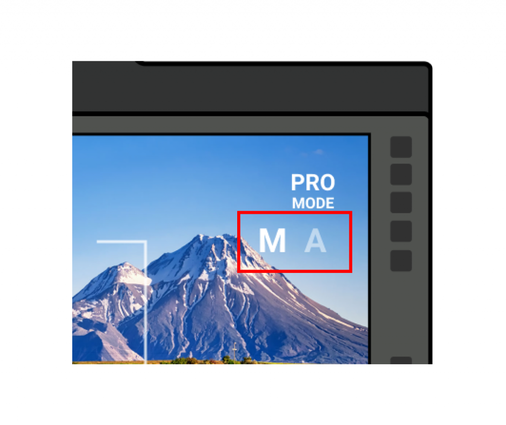
Version II
the “A” is grayed out to indicate it is active like digital camera UX language
Users found this confusing. ❌
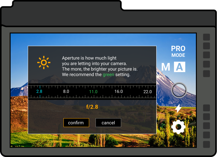
Final Client Design
The A is inverted and filled, like the Youtube UI to easily indicate the user is on that state
This was implemented in the design ✅.
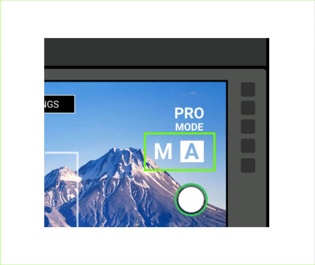
User were still confused with the improved solution. I found the final solution via the Youtube UI to find a commonly recognized industry solution using filled button backgrounds to show the active mode.
Deliverables
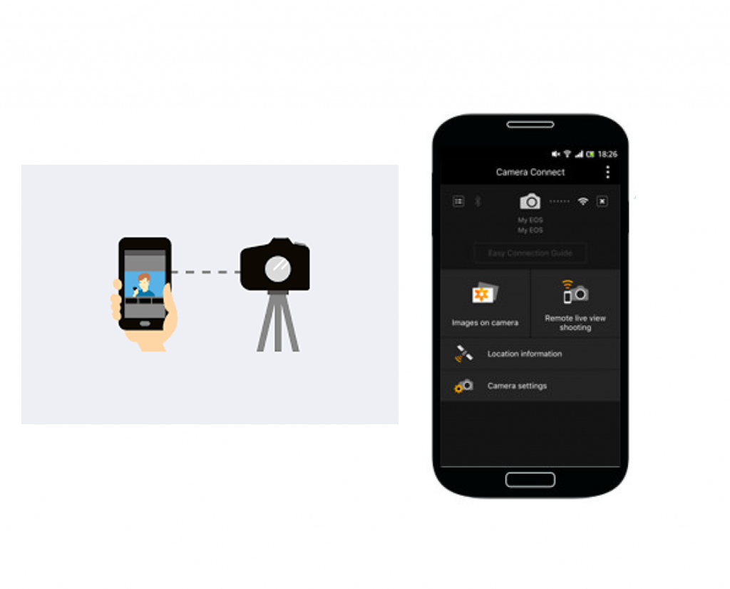
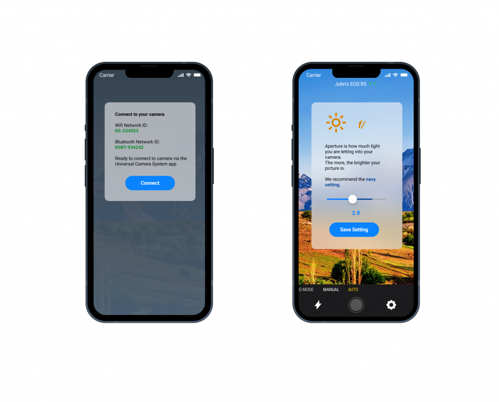
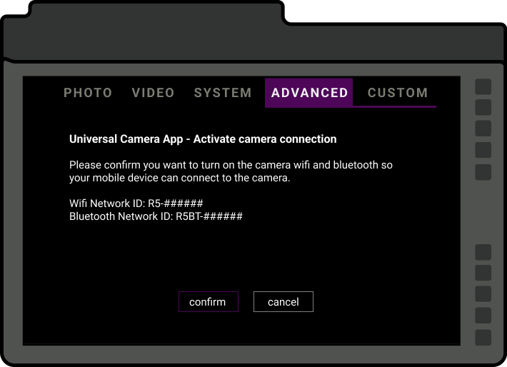
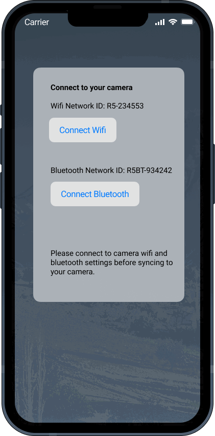
Camera Connect – Pair with Phone
Take a Picture – Auto Mode
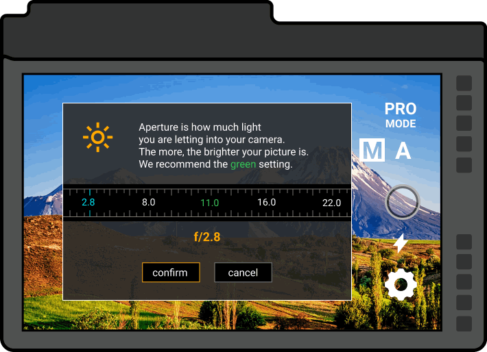
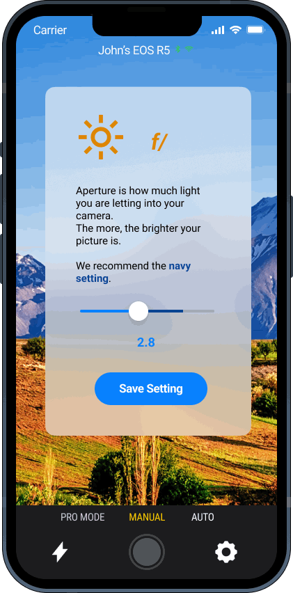
Take a Picture – Manual mode
Change Settings
Outcome
An easier introduction to camear UX for beginners
I have shown this to beginner photographer users and their feedback is positive. They think it is a good concept to introduce new users to the camera. I hope that I encounter connections with future digital camera manufacturer companies as a proposed user solution.
Conclusion & Next Steps
As the sole UI/UX designer, by revamping the user introduction to digital cameras, I was able to instill a greater sense of empowerment and confidence in users. Increasing user confidence will directly increase consumer confidence and product retention.
My initial UI designs relied heavily on guided tutorials, which limited user control. Through careful consideration of user empathy, I identified the need for an opt-out option during these tutorials, which restored full user control.
Ultimately, this new approach to user introduction to digital cameras resulted in a more engaging and educational experience. I am confident that this design can be implemented in future camera products to enhance user experiences as it does not conflict with the existing user interface product and can be generically reproduced.
A successful UX metric indicator would be if the product quality of digital cameras increased while mobile devices decreased.
If we increase sales of digital dSLR cameras with improved UX, we would drive down the sales of phones for photography purposes to reclaim older higher sales figures.