
Job Hunt AI Buddy | UX Page Redesign
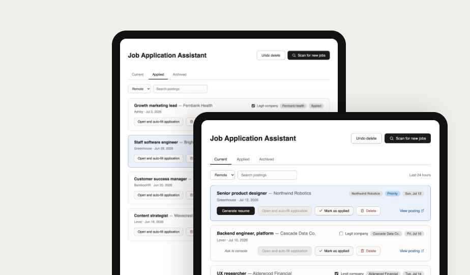
MY ROLE: Product Designer & Developer
TOOLS: Figma AI, Claude Cowork & Code, GitHub
DURATION: 20+ hours
Job apply with AI resume tailoring + ghost job check
Problem
Job seekers today are showing higher stress levels — driven by AI-related layoffs, ghost job postings, and the daily grind of reapplying on repeat. On the other side, company recruiters have access to enterprise-grade AI screening tools built to find exactly the candidates they want for their UX needs.
Solution
Job Hunt AI Buddy helps level that playing field. It scans for relevant postings, tailors resumes and cover letters to each one, and flags likely ghost jobs before time gets wasted on them. The job seeker still reviews the AI-assisted results and applies manually, keeping it genuine enough to avoid getting flagged by employer screening.
Product Demo
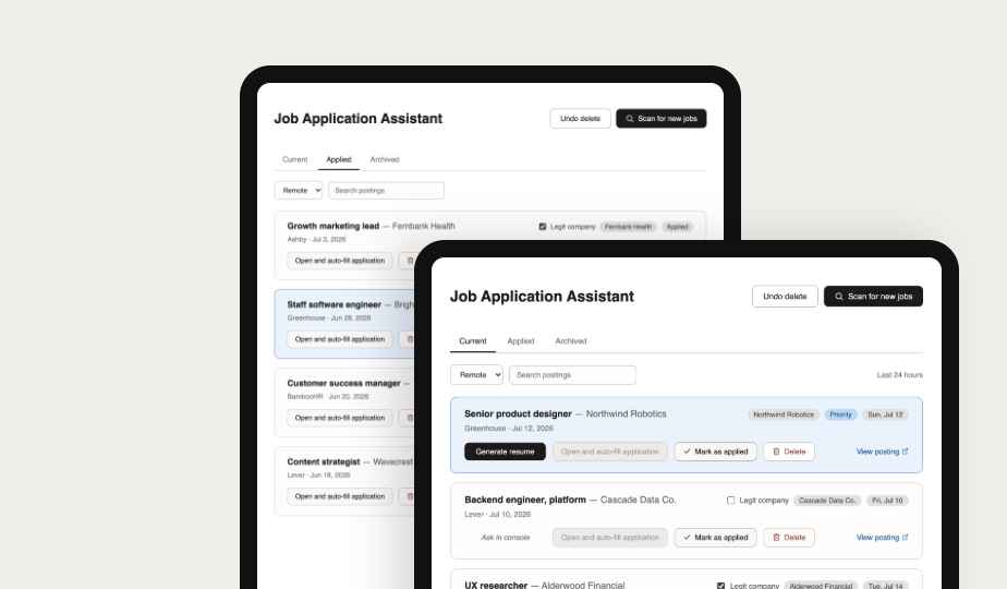
Role
I recognized how repetitive and exhausting job applications had become — endless tailoring, forms, and ghost postings. So I built a tool that scans jobs, tailors resumes and cover letters, and flags shady listings. I designed it like a recruiter’s ATS dashboard, but for job seekers screening postings instead of candidates. Then I guided Claude Code to help build it as a former developer. I deployed it as a public open-source tool on GitHub for other job seekers facing the same challenges.
What Others Do Well
Our team did product research on direct and tangential competitors. Mine included Asana, Monday, and ClickUp of their pricing pages.
 We used Claude CoWork to analyze market product needs met from competitors.
Jobsight
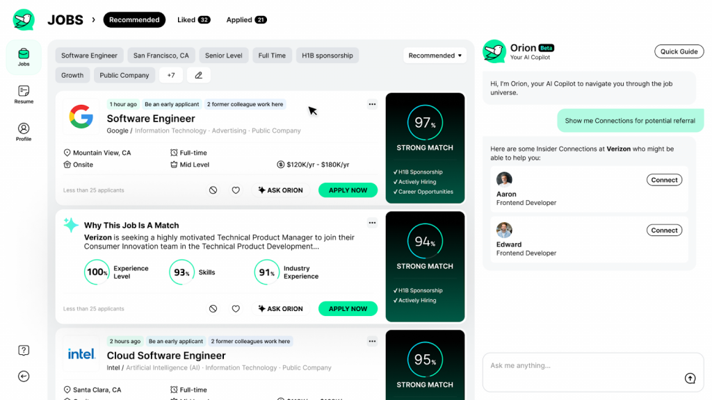
- AI copilot actively finds and scores relevant postings — no manual searching needed.
- 1-click autofill extension makes applying nearly instant once a job is chosen.
- Runs on a proprietary cloud model, so nothing stays local.
- No way to check whether a posting or company is actually legitimate.
Careerflow AI
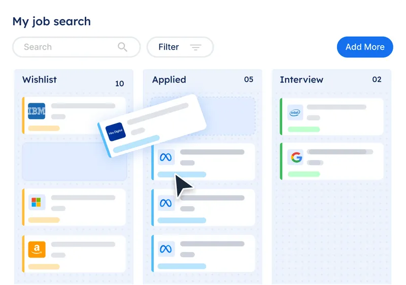
- Focuses on resume scoring and improvement suggestions rather than automating anything.
- Never submits or tailors on the user’s behalf — lowest-risk of the three.
- Doesn’t scan for jobs or tailor materials per posting.
- Best suited as a companion tool, not a full application workflow.
Applykit
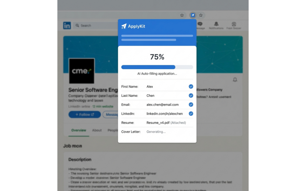
- Tailors resumes with a local LLM (Ollama), so nothing leaves the user’s machine.
- Fully open-source and free — closest philosophy match to this project.
- Doesn’t scan for postings or check legitimacy.
- Autofill and final-submit behavior aren’t clearly documented.
Survey & Research
We used Claude CoWork to analyze user research for affinity map and other findings.
Survey
We put together a quick Google survey asking what frustrations users had (50 users). These were the most 2 relevant user questions from the data.


Affinity Map
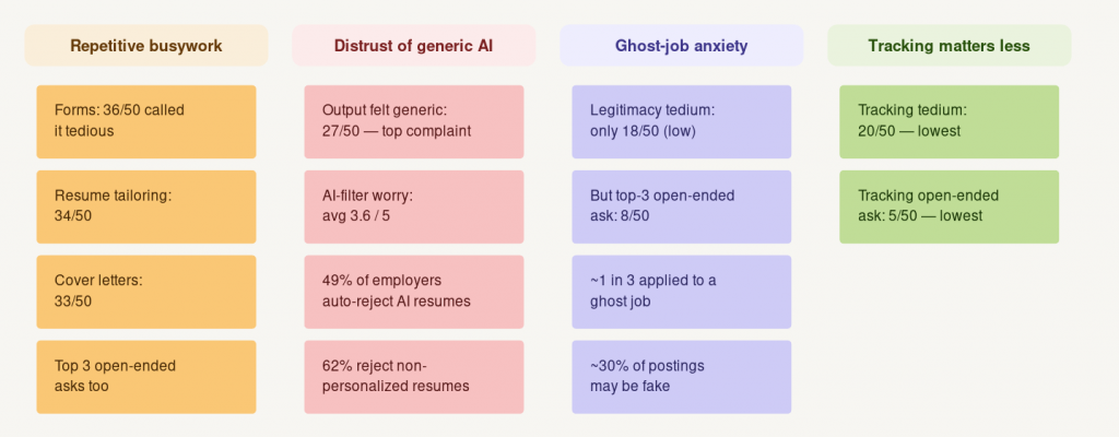
Repetitive busywork is pain
forms, tailoring, and cover letters were the top three “most tedious” tasks, and the app’s core loop targets exactly that.
Generic AI output kills trust
“felt generic” was the #1 AI complaint, so generation stays a deliberate, reviewed step, not a black box.
Ghost jobs are a big fear
nearly 1 in 3 seekers have applied into a fake posting, which is why legitimacy checking made the cut.
Ideation
 As a user, I want a tool that finds real job postings and tailors my resume for them.
Prop Values
Jobs matched to user needs
Claude AI tailored resumes
Jobs organized by user actions
Wireframe Brainstorming
I looked at many dashboards, using salesforce as a UI example. I then looked at recruiter dashboards as inspiration.
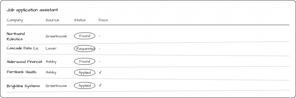
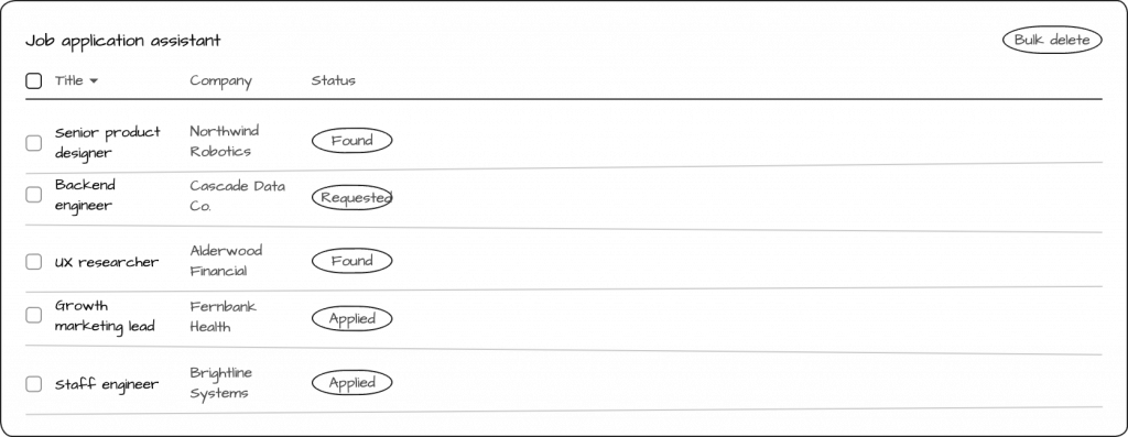
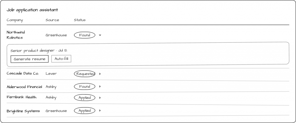
Usability Testing – Wireframe
Desktop Design
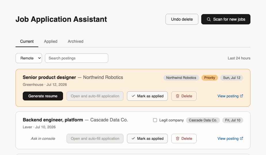
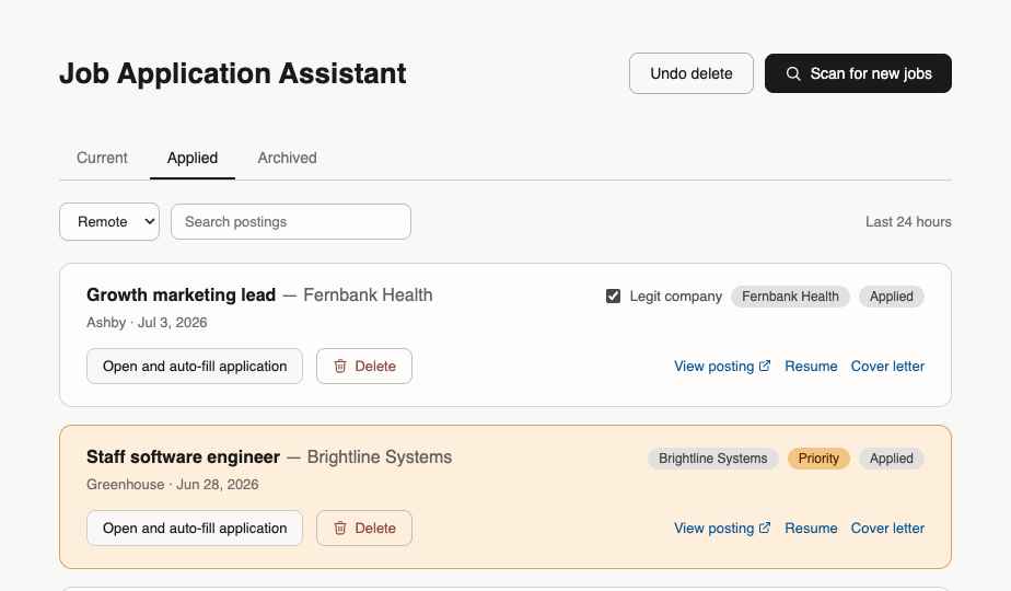
Claude CoWork was used to synthesize granular data findings from usability testing.
Wireframe Usability Test Results
1. Generate a tailored resume.
2. Apply for a job with AI-assisted tailored resume.
3. After applying, mark that job as “applied”.
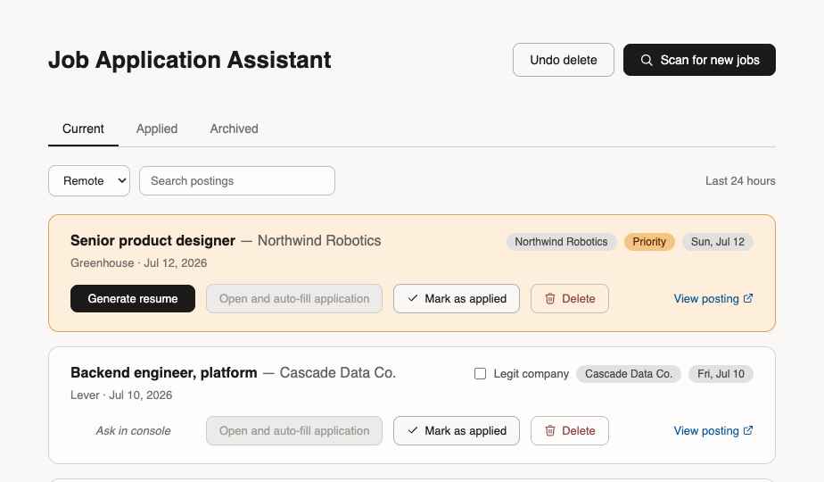
- ✅ All of our users were able to apply for a job and marked it as applied (5/5 user)
- ❌ The users voiced the steps were oversimplified for the usability test
(due to technical limitations, this was simplified. You could have to go into the Claude AI to get the files and apply manually for true use)
Pros
- users able to track jobs applied
- users able to use tailored resumes
- user able to previous jobs (archived)
- users able to easily navigate to previous jobs if they receive callback from company from interview vs other manual tracking system
Cons
- user not exposed complex claude console/local desktop file/manual application proces
- user not exposed to having to start up code to have webapp work locally (setup required)
- user not exposed to hardcoded future roadmap functions (job type, job search, time duration of job search, job location/distance radius, etc)
- no search function in initial version – manual browser word search
START HERE
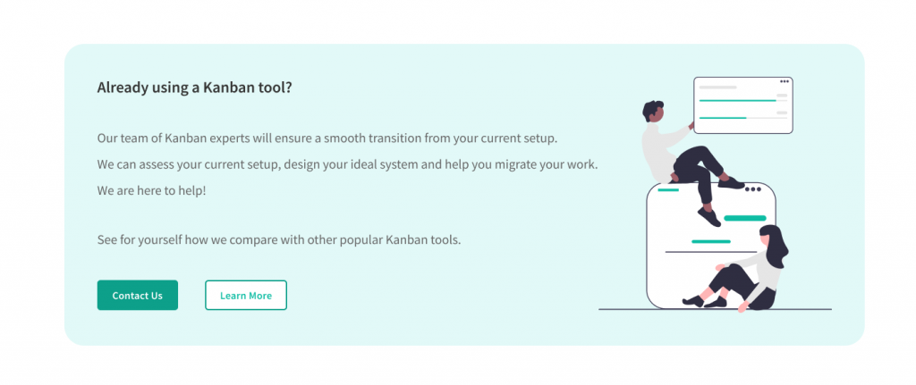
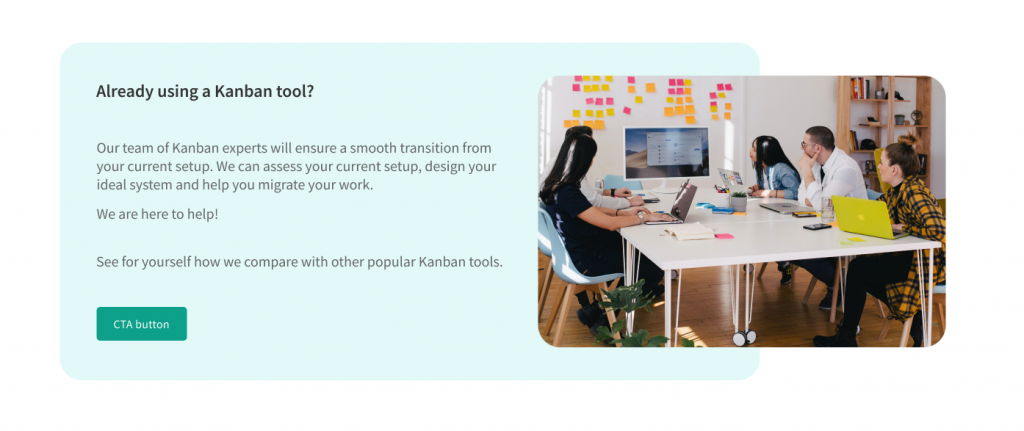
Client Addition – Marketing Module
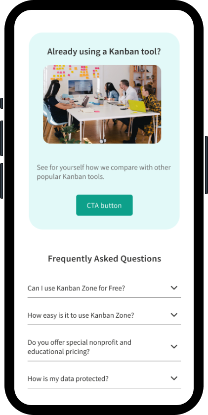
The client requested the addition of a marketing contact module for users to get in touch with customer reps.
Variation A – use of iconography as a graphic
Variation B – use of imagery as a graphic, client preferred
Plans Module Iterations
Variation A – My version
I attempted to modernize the UI from the literal translation of the old page.
Rejected Version
Variation B
Utilizing the Asana UI language keeping the existing UI content
Preferred version
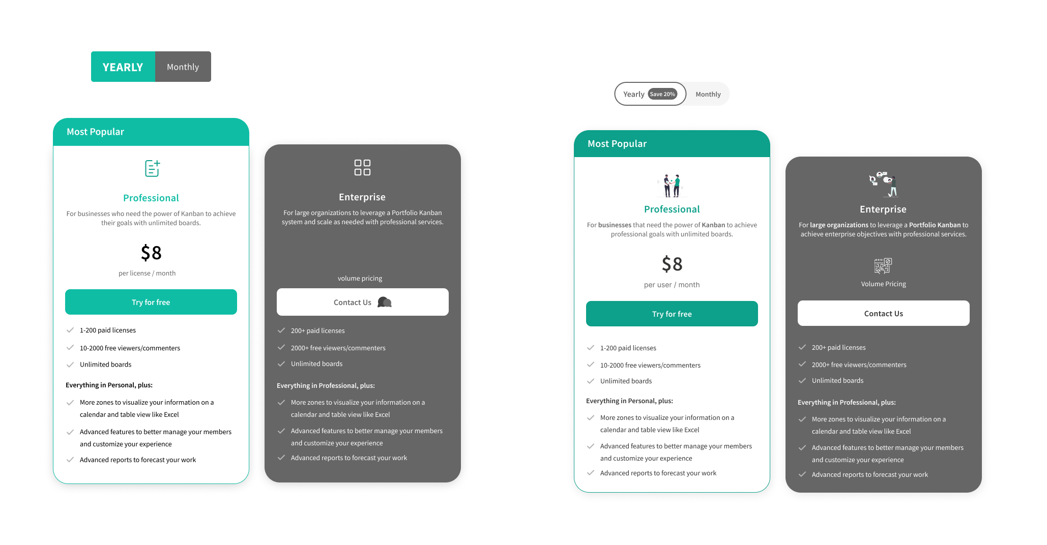
As the project manager and UI/UX designer, I led my team in various ways. I set the page template and created interactive components, while the rest of the team focused on the UI detail work.
Add On Module Iterations
The client increased number of addon card products from 4 to 10 to expand product offerings at the time.
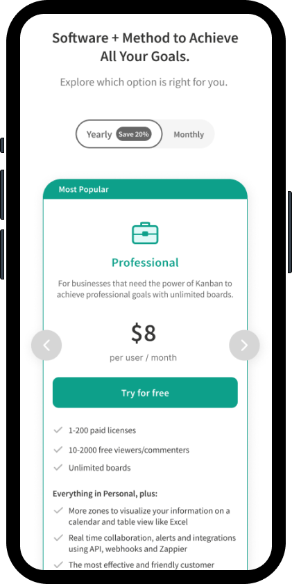
We chose a carousel to display the information as the best mobile-first UX solution.
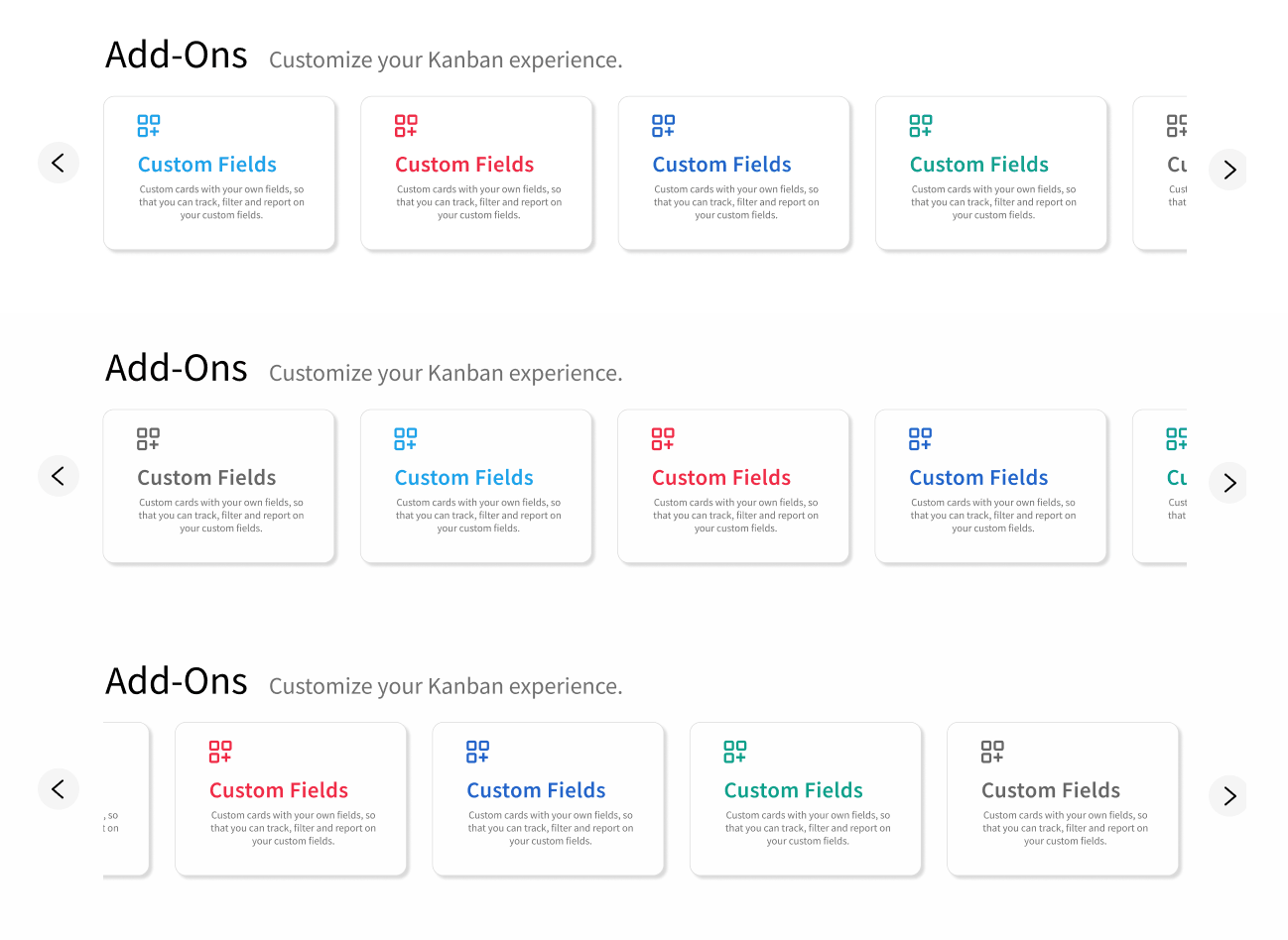
Figma AI was used to assist in design systems and rapid prototyping.
Usability Test – High Fidelity Design
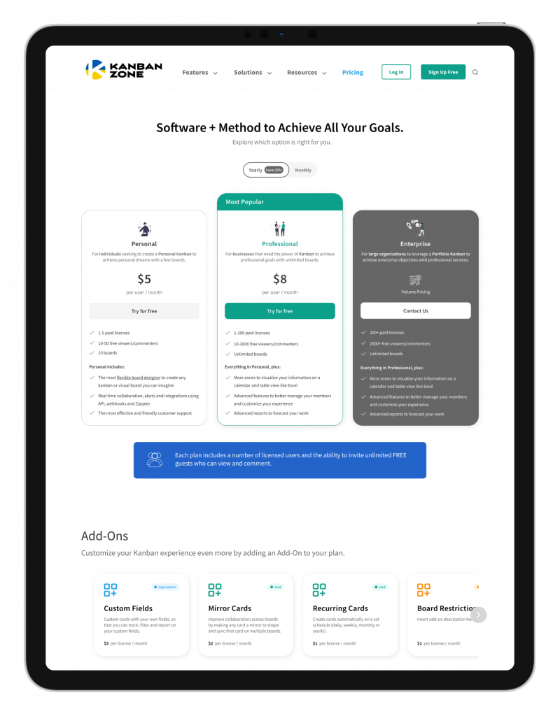
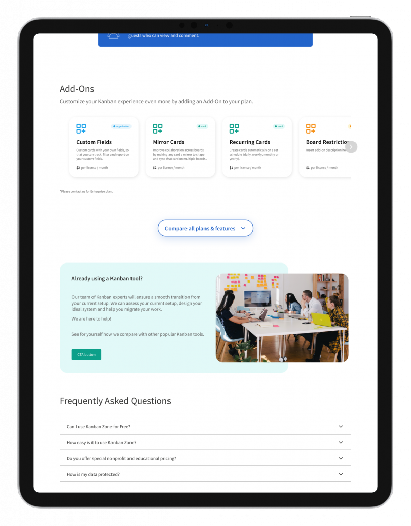
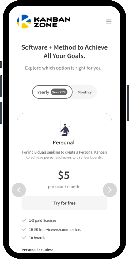
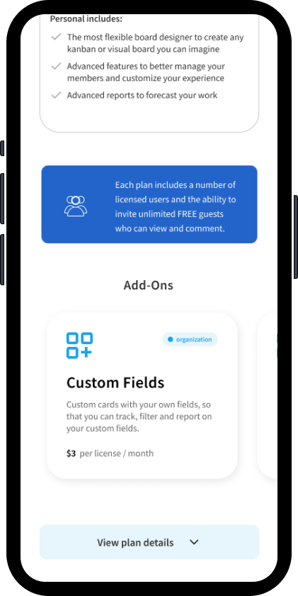
First High Fidelity Testing
We used the same testing script as the lo-fidelity test.
Desktop
Mobile
High Fidelity Usability Test Results
- ❌ Users missed the UX interaction to compare plans
- ❌ Users did not interact with the Add-Ons module
- ❌ Users did report having to scan through which information was the most important and that it was difficult to find the key information upon opening the page
Claude CoWork was used to synthesize granular data findings from usability testing.
Post User Test Changes
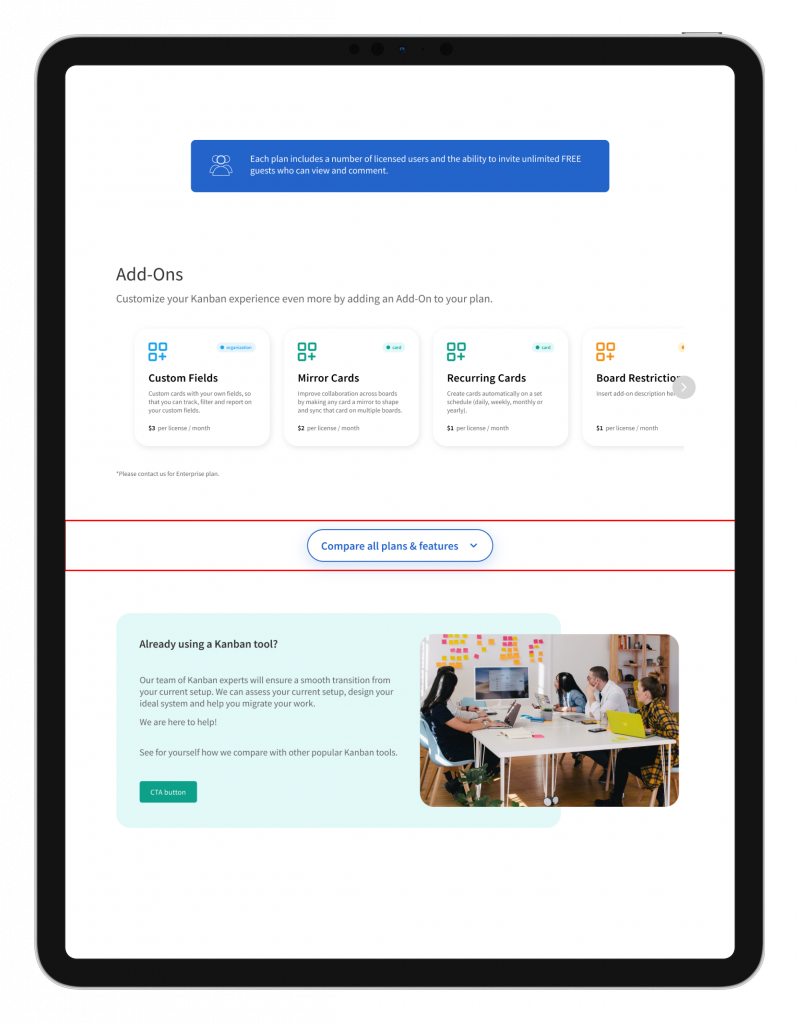
Original
Users reported having difficulty seeing the view plan to sign up for a plan via the Plans Comparisons module (page goal
Update
The Plans Comparisons module was moved up so the users could see the features to convert faster
Improved Solution ✅
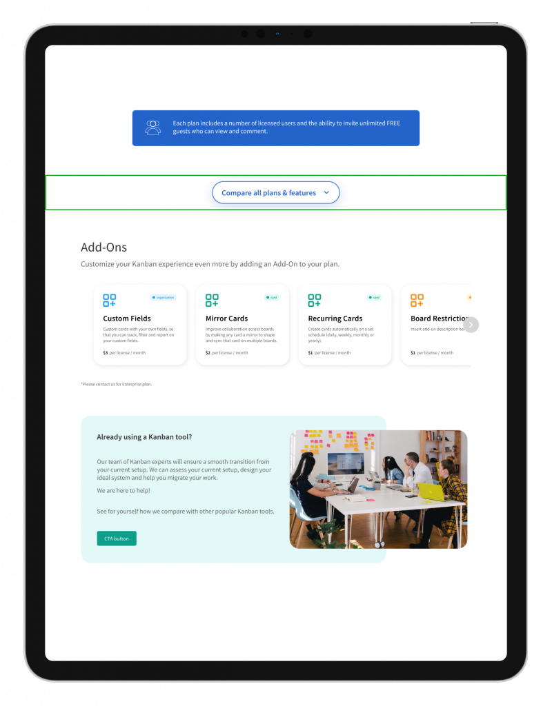
Final Design
Site Improvements
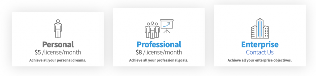
❌ The existing site has confusing iconography and difficult typography to read
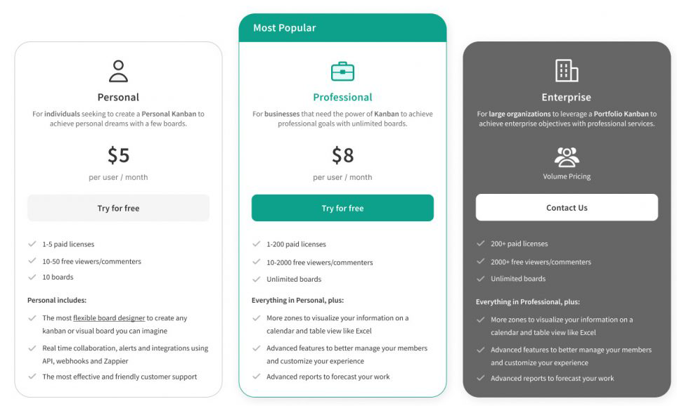
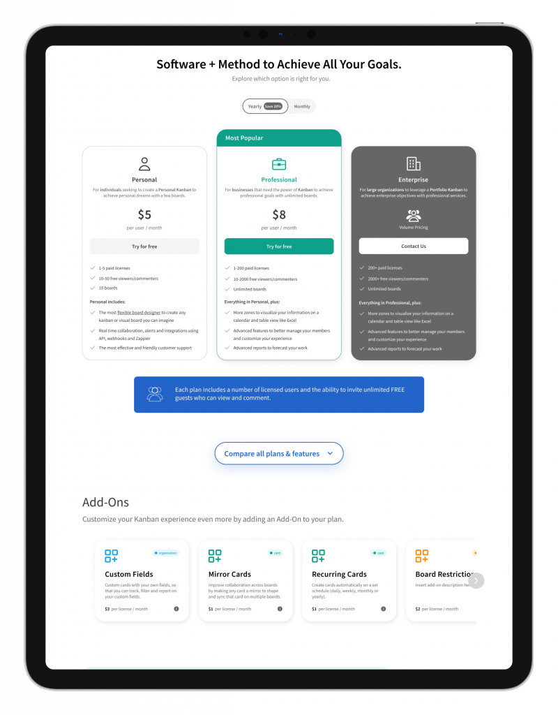
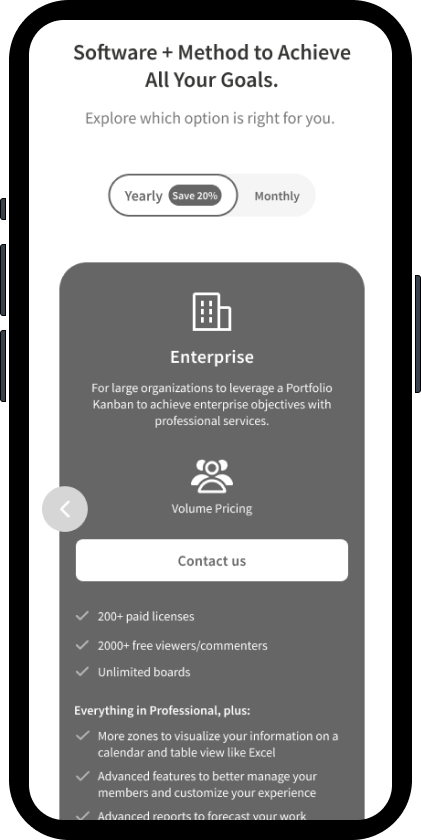
✅ The plans module looks modern and easy to navigate with relevant information.

❌ The existing site has seemingly random CTAs below the plans for UX content organization.
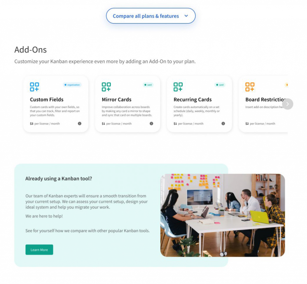
✅ The Add Ons Module is a modern carousel and easily scannable.
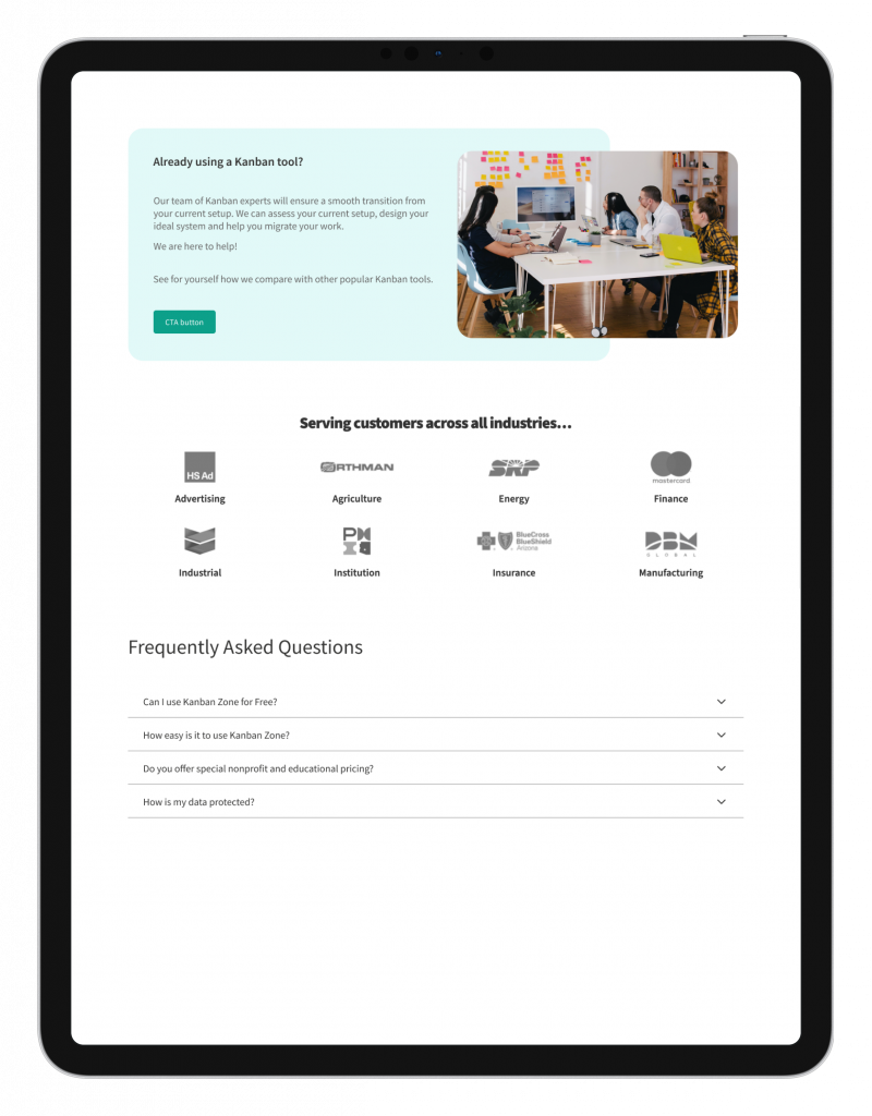
✅ Additional CTA callout at the bottom for user conversion.
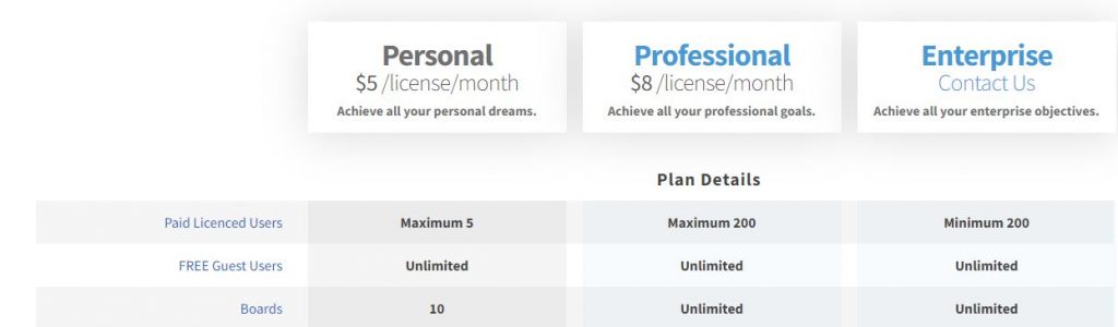
❌ The Plans details gives too much irrelevant information and has poor visual design.
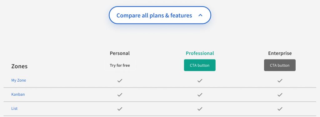
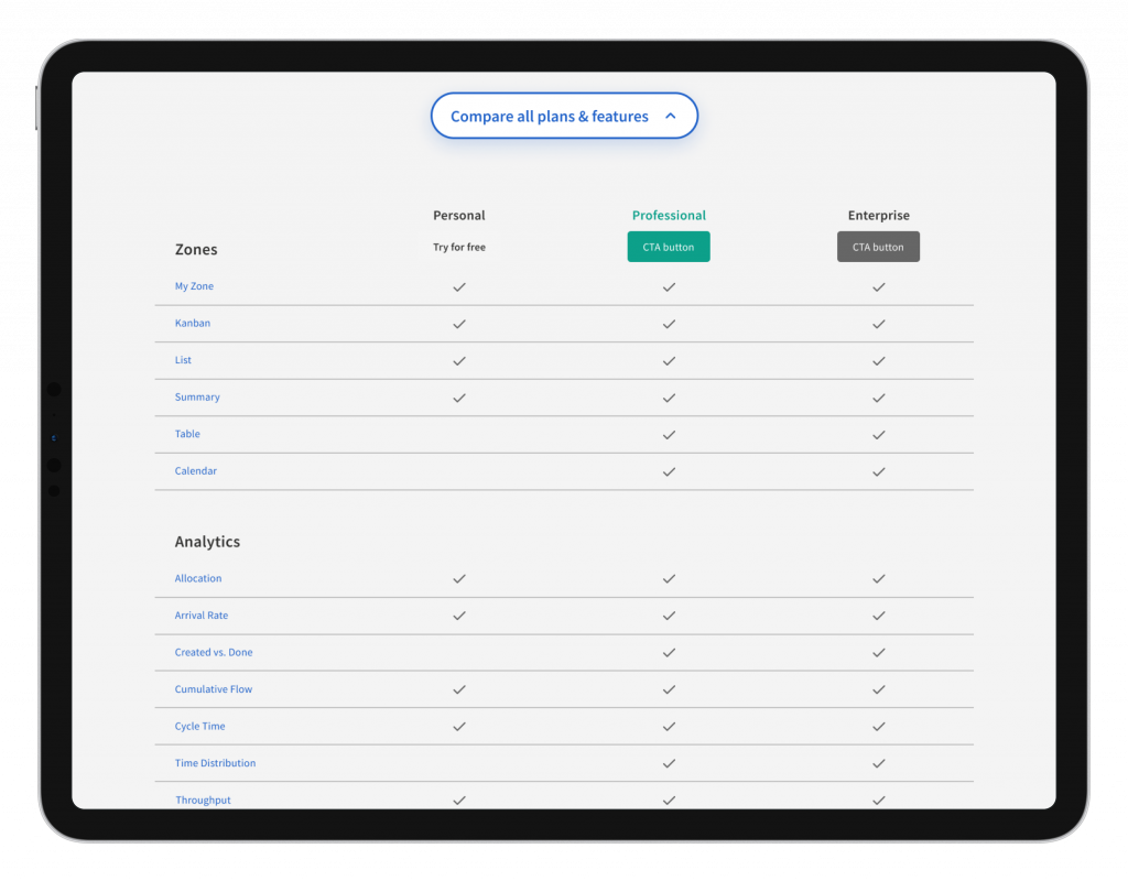
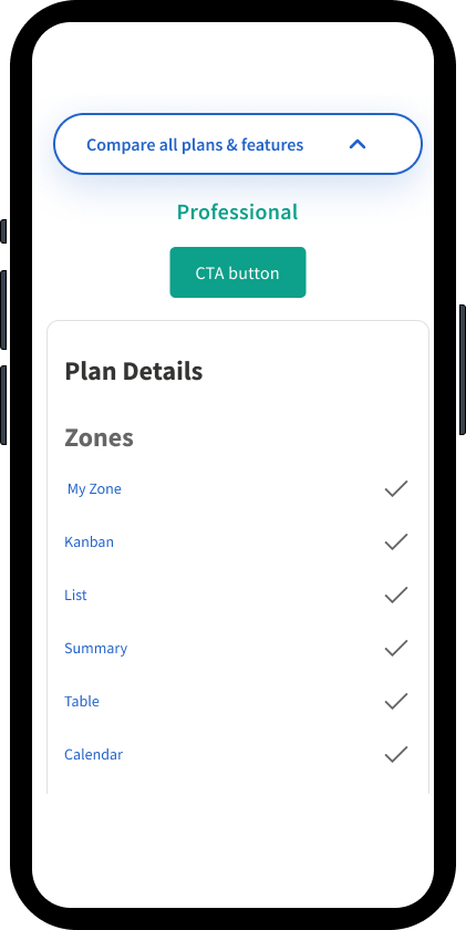
✅ The Plan Details Module is a modern collapsible accordion with key content.
Here is the final deliverable we gave to the client. We incorporated their request for final content and the Kanban design system.
Click to enlarge images.
Desktop
Mobile
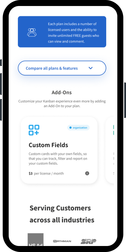
Desktop and Mobile Data Accordions
Client Feedback
Initially, the client was hesitant about conducting UX testing, but with the support of our combined UX testing results, they were very satisfied with the design. We maintained the existing design system’s look of the page while giving it a visually appealing modern feeling that was user-friendly while accessible.
Live Product
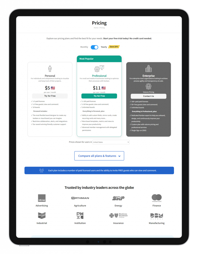
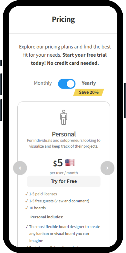
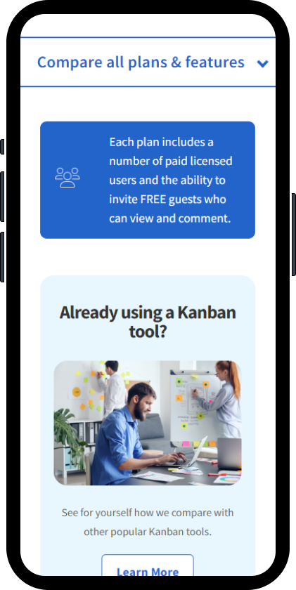
The client made some minor changes and added some functionality updates (language selector) and the page is live. Subject to change by client since project went live circa 2022.
Outcome
 Increased prodcut signup by 50%
Our design team does not have the exact web analytics, but analytics from App Store downloads and product user traffic reviews strongly indicate conversion increased by 50% and the redesigned page has been very well received with user feedback.